

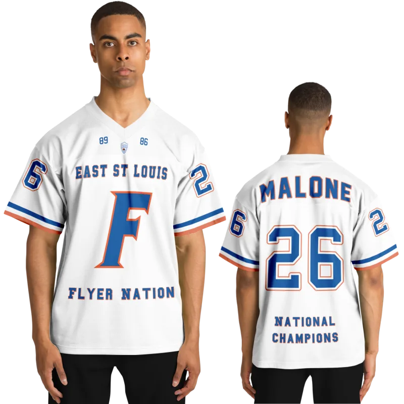
You remember exactly how it felt. The slight weight of the mesh across your shoulders, the way the number sat flat against the chest — not raised, not embroidered, just printed clean with that particular thickness of ink. The sleeve stripes hit at a specific point on your upper arm, and the collar had a looseness that nothing made today quite captures.
Then you order a throwback football jersey online and it arrives looking almost right. Almost.
If you've been trying to track down something that actually matches the jersey from your playing days — or the ones worn by teams you watched in the late '80s and early '90s — this is the article that explains why finding the right one is harder than it should be. Not because throwback football uniforms are rare, but because almost no one selling them explains what physically made the originals different.
That's what this article does. We're going into the construction: the mesh, the cut, the printing method, the number weight, the stripe geometry. By the end, you'll know exactly what to look for and exactly what to ask for — whether you're ordering for yourself, your kid, or just trying to get one that looks the way you remember it.
The Fabric Was Heavier and It Had a Specific Drape
The single biggest reason a vintage football jersey looks different from a modern throwback version isn't the logo or the colorway. It's the mesh.
Jerseys from roughly the mid-1970s through the mid-1990s were typically made from a nylon diamond-mesh fabric — sometimes called birdseye mesh — with a heavier hand than anything produced today. The denier count (the thickness of the individual fibers) was higher, which meant the fabric had actual body to it. When you held it up, it held its shape. When you wore it, it draped across the shoulders rather than clinging.
Modern performance jerseys moved decisively toward polyester microfiber around the late 1990s and early 2000s, chasing moisture-wicking properties and lighter weight. The result is a fabric that's genuinely better for playing in — it manages sweat more effectively and reduces heat buildup. But it looks fundamentally different on film and in memory. The sheen is different. The drape is different. The mesh hole pattern is smaller and tighter, which changes how the jersey photographs and how it appears at a distance.
What this means when you're ordering: A true vintage football jersey — the kind that reads as a 1980s or early 1990s game jersey rather than a contemporary throwback — will specify the mesh type. Look for nylon mesh or birdseye mesh in the product description rather than polyester interlock or performance poly. If the fabric isn't specified, ask. The wrong fabric is the most common reason a throwback looks almost right but not quite.
The Mesh Hole Size Changed the Entire Visual Texture
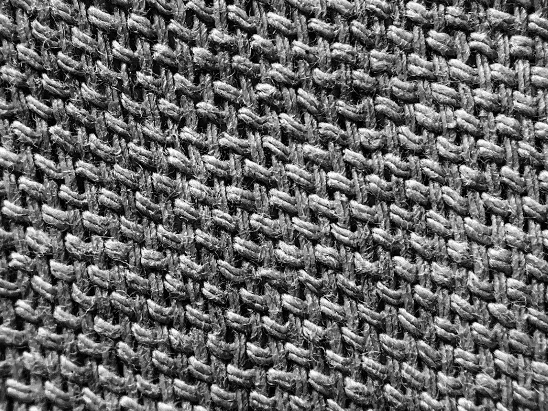
This detail gets overlooked because no one photographs it at close range, but it's visible in every game photo from the era. The diamond-mesh openings in jerseys from the 1970s through the early 1990s were larger — typically 3mm to 5mm across — which created a visually open texture that read differently on camera than the tight-knit fabrics used today.
Look at any Pittsburgh Steelers throwback jerseys photo from the 1970s Bradshaw era and compare it to a modern version inspired by that same design. The fabric texture is simply not the same thing. The original has that open, airy look that lets a small amount of background show through the weave. Contemporary throwback versions, even licensed ones, typically use a tighter mesh that reads as more uniform and modern.
The Shoulder Cut Was Wider and the Armhole Was Lower
You can spot an authentic-era football jersey silhouette in a single frame. The shoulders are wider — not dramatically, but measurably. The armhole sits lower on the body, which creates a looser fit through the chest and allows the sleeve to hang differently when the arm is at rest.
This cut was functional for the era. Players wore substantial shoulder pads, and jerseys were designed to fit over those pads without being skin-tight. The result was a cut that looks almost oversized by contemporary standards — but it was engineered to that exact dimension.
When jersey construction shifted in the late 1990s — accelerated by the NFL's uniform modernization and the growth of authentic throwback jersey sales — designs were reworked for off-field wear. The cut became slimmer, the armhole rose, and the shoulder width decreased. This is the single change that makes a modern throwback football jersey read as contemporary even when the colorway is vintage-accurate.
Three things to look for in the shoulder construction:
- Shoulder width measured from seam to seam (authentic 1980s NFL jerseys typically measured 22–24 inches across a size XL, versus 19–21 inches for modern athletic cuts)
- Armhole depth — a lower armhole will fall visibly below where a modern jersey's armhole sits
- Chest circumference relative to waist — vintage jerseys have minimal taper, while modern jerseys are noticeably narrower at the hip
Screen Print vs. Embroidery vs. Tackle Twill — Why the Numbers Look Different on Throwback Football Jerseys
This is where most throwback guides say nothing useful. They'll tell you a jersey has "embroidered numbers" and treat that as a quality signal. For throwback accuracy, embroidery is often the wrong answer entirely.
Screen-Printed Numbers: The Actual Era-Accurate Method
From the 1960s through roughly the mid-1990s, the dominant method for applying numbers to game jerseys was screen printing — a process that pushed ink through a mesh stencil directly onto the fabric. The result was a number with a specific visual character:
- Flat against the fabric surface with no raised edge
- Slight texture variation where the ink density changed across the number face
- A matte finish that contrasted subtly with the jersey fabric's sheen
- A specific hand feel — not smooth like modern transfers, not three-dimensional like embroidery
Screen-printed numbers fade in a characteristic way. The edges lighten before the center, creating a subtle gradient that's immediately recognizable as authentic wear. Modern versions that use heat-transfer vinyl don't age the same way — they peel from the edges rather than fading through them.
Tackle Twill: The Upgrade That Changed the Look
By the late 1980s, tackle twill — fabric letters and numbers sewn onto the jersey — had become the standard for higher-end game jerseys. This is different from embroidery. Tackle twill produces a number that's flat but visible as a separate layer of fabric. The edges are stitched down cleanly, and the number has a slight three-dimensional presence without the raised texture of embroidery.
This is the construction used on the most iconic jerseys of the early 1990s. A Seattle Seahawks throwback jersey in the style of the Royal Brougham-era uniforms — the distinctive blue and green — would have used tackle twill on the numbers and name bar.
Embroidery: What It Actually Does to the Look
Embroidery raises the number off the jersey surface through thread density. It's a durable application method and it reads as premium — but it reads as premium in a contemporary way. The original game jerseys that most players remember did not have embroidered numbers. The thickness and texture of embroidery on a throwback jersey is a modern addition, not a vintage feature.
Mitchell & Ness throwback jerseys — widely regarded as the benchmark for licensed throwback accuracy — have used tackle twill construction on many of their historical tributes, which is one reason they read more authentically than cheaper alternatives. When someone in the collecting community says a Mitchell and Ness throwback jersey "looks right," the tackle twill application is a significant part of what they mean.
The Stripe Geometry and Placement Was Specific to the Era
Sleeve stripes on football jerseys from the 1970s and 1980s were placed at a specific point on the upper arm — typically starting 2 to 4 inches below the shoulder seam and running in parallel bands across the full circumference of the sleeve. The stripe width, the gap between stripes, and the number of stripes were all part of the team's visual identity, held to specific tolerances each season.
What changed: as jersey cuts became slimmer and sleeves shorter, the stripe placement migrated. On a fitted modern jersey, sleeve stripes appear higher on the arm, closer to the shoulder seam, because there's less sleeve to work with. The same stripe pattern that covered 4 inches of upper arm on a 1988 jersey now appears compressed onto 2.5 inches of a modern fitted sleeve — and the proportions read as visibly wrong to anyone who wore or watched those originals.
The Philadelphia Eagles throwback jersey in the style of the Kelly green era (1960s through 1995) is a useful example. The stripe placement on those original jerseys — two kelly green stripes on a white sleeve, hitting mid-upper-arm — is specific to that cut. Versions that use a contemporary slim fit push those stripes upward, and the jersey reads as a tribute rather than a faithful stylistic reference.
The Collar Construction Also Changed
Original jerseys from the 1970s and early 1980s used a heavier ribbed collar, often in a contrasting color, that sat loosely around the neck. By the mid-1980s, this had evolved to a thinner collar with less structural weight, and by the mid-1990s, the collarless or minimal-collar construction had become standard. If you're trying to match a jersey from a specific era, the collar type is a date-stamping detail that most buyers don't notice until they compare side by side — and then can't unsee.
Font Weight and Number Outline — The Details That Date a Jersey Instantly
Every era of professional football had characteristic number typography, and the differences are more significant than most people realize.
Jerseys from the 1970s typically used a heavier block font with minimal outline — the number itself was wide and had substantial stroke weight. Through the 1980s, outlines became more common, and by the early 1990s, double outlines (number fill color + first outline + second outline) were standard across much of the NFL.
The Philadelphia 76ers throwback jersey — crossing briefly into basketball territory because the construction principle is identical — demonstrates this clearly. The font used on 1960s and 1970s NBA jerseys has a specific character: wider strokes, less kerning, and minimal or no outline. Modern versions that use a cleaned-up digitized version of that font read as contemporary even when the colorway is accurate, because digital font rendering eliminates the slight imperfection and stroke variation of the original screen-printed typography.
For football specifically: the number outline thickness on 1980s NFL jerseys was typically 0.5 to 0.75 inches, and the outline color matched the team's secondary palette exactly. Modern throwback versions sometimes use a thinner outline or a slightly off color match, and the difference is subtle but registers as "not quite right" to anyone who watched those original teams.
Marcus T., 44, grew up watching his older brother play high school football in Pennsylvania in the late 1980s. He ordered a custom jersey through iPlayedFor to honor the uniform his brother wore — royal blue mesh, gold numbers with a white outline, the specific block font the team used. When it arrived, he said the number weight was the first thing he checked. "I knew the font immediately. That's the one."
What to Actually Ask For When You Order
The difference between a throwback that looks right and one that looks like a modern jersey with vintage colors comes down to four specific decisions:
- Fabric type: Specify nylon mesh or birdseye mesh. If the retailer only offers polyester, ask about mesh weight and hole size.
- Number application: Ask whether numbers are screen-printed, tackle twill, or embroidered. For pre-1995 accuracy, screen print or tackle twill are the era-appropriate choices.
- Cut: Ask about shoulder width and armhole depth. A vintage-accurate cut will be notably wider in the shoulder than a contemporary athletic cut.
- Font and outline specification: Provide a reference image if possible. State the outline thickness and whether you want single or double outline. The specific number weight is the detail most often approximated rather than matched.
For teams with well-documented uniform histories — the Pittsburgh Steelers throwback jerseys from the 1970s, the Eagles throwback jersey from the Kelly green era, or the seahawks throwback jerseys from the original 1976 expansion season — reference images are widely available online and serve as the most precise specification you can give a custom jersey maker.
It's also worth knowing how jersey numbers worked in the original era you're drawing from. The NFL's positional numbering system, formalized in 1973, assigned specific ranges to each position — quarterbacks wore 1–19, running backs and defensive backs 20–49, and offensive linemen 60–79. Matching a number to the right positional range is a detail that players and serious collectors notice, and getting it right adds a layer of authenticity that goes beyond the fabric.
Your jersey is still out there waiting.
Design yours in minutes and see your name and number exactly the way you remember it.
Frequently Asked Questions
Do jersey numbers mean anything in football, and were they always assigned the same way?
Yes — jersey numbers in football are assigned by position, and the system has evolved over time. The NFL formalized its numbering rules in 1973: quarterbacks and kickers wear 1–19, running backs and defensive backs 20–49, linebackers 50–59 and 90–99, and linemen 60–79 (with expansions added in subsequent decades). How football jersey numbers are assigned has also shifted at the college level, where rules are more flexible and have changed more frequently. For throwback accuracy, matching the number range to the player's position is a detail that collectors and former players notice immediately — it's one of those things you can't unsee once you know it.
What's the difference between a Mitchell & Ness throwback jersey and a standard licensed version?
Mitchell & Ness throwback jerseys are produced using archival specifications — the brand licenses historical team records to inform the fabric weight, number application method, and cut used in the original season being honored. Standard licensed versions from the NFL's current program use modern materials and contemporary fits. The price difference reflects the construction research involved. For throwback accuracy in the style of original game jerseys, the Mitchell & Ness approach produces results that are closer to the originals; for everyday wear, modern versions are lighter and more comfortable.
Why do some throwback football uniforms look faded even when new?
Intentional distressing — a wash or treatment applied to simulate game-worn wear — is a finishing technique used on some vintage-style football jersey productions. It's designed to suggest the specific way screen-printed numbers and nylon mesh aged over a playing season. For custom jerseys, most manufacturers offer both a clean version and a distressed version. If you want the jersey to look like it's been through a season, the distressed finish is the more evocative choice. If you want the equipment-room-fresh look, the clean version is correct.
Can I get a throwback jersey with a name bar if the original team didn't use one?
Yes — most custom jersey makers can apply or omit a name bar regardless of the team's historical practice. It's worth knowing that many NFL teams before the mid-1980s did not consistently use name bars, and adding one to a jersey meant to evoke a specific era will date it inaccurately. If throwback authenticity matters to you, check whether the team used name bars in the specific year you're drawing from. The seahawks throwback jersey in the style of the original 1976 expansion season, for example, was produced without name bars — a detail that distinguishes a careful tribute from a generalized throwback.
What does "screen-printed football jersey" mean versus a heat-transfer jersey?
Screen printing forces ink through a mesh stencil directly into the fabric fibers. The ink bonds with the fabric, fades gradually with washing, and doesn't peel. Heat transfer applies a vinyl or polyester film to the fabric surface using heat and pressure. Heat-transfer numbers look similar initially but peel from the edges under repeated washing, and they don't age in the same way screen-printed numbers do. For throwback accuracy and long-term durability, screen printing is the better choice for numbers and names on a vintage-style jersey.
See also: what to do with your old varsity letter jacket | personalized sports gifts vs generic options | the right jersey size for a throwback fit | custom softball jerseys show how alumni-style uniforms work | why the uniform itself carried so much identity for former players