

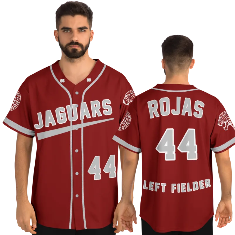
You can still feel the weight of it.
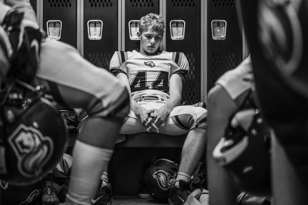
Not the fabric — though you remember that too, the way it sat differently on your shoulders in the fourth quarter when it was damp and heavy and the game was still undecided. What you remember is what wearing it meant. The specific combination of number, color, and name that told everyone on that field exactly who you were.
Choosing custom jersey design by emotional era is not the same question as picking your favorite color or your lucky number. It is a much older question than that. It is the question of which version of yourself you most want to hold in your hands again — and that question deserves more than a size chart and a color picker.
Most jersey design resources stop at the surface. They tell you how to upload a logo or adjust a font weight. They never ask the thing that actually determines whether your finished jersey feels right or merely looks correct. The difference between those two outcomes is what this guide works through, start to finish.
The Emotional Era Problem: Senior Year vs. Your Best Season
Here is the conflict that stops more former athletes mid-design than any font choice ever will.
Your senior year jersey carries the finality of it — the last time you wore the full uniform, the last time your name appeared on an official roster. There is something ceremonially significant about that particular design. It represents completion. Belonging. The full arc of what you built inside a program.
Your best season jersey carries something else entirely. It carries the specific feeling of when everything clicked — when you were playing at a level that surprised even yourself, when the game slowed down in a way it never quite did before or after, when you were genuinely inside it in a way that is almost impossible to explain to someone who hasn't experienced it.
These are not always the same year. In our experience, they are often years apart — and the person who sat down to design a jersey thinking "I'll just do my senior year" sometimes realizes halfway through that the number they keep returning to is from sophomore year. That's not a mistake. That's the right answer trying to surface.
The framework for resolving this isn't complicated, but it requires two specific questions before you touch a design tool.
Question 1: What do you want to feel when you look at it?
If the answer involves pride in your team, your school, your program — the full shared experience of belonging to something larger — your senior year is almost always the right era. That jersey represents your complete membership in the thing, not just your individual peak within it.
If the answer involves a specific, private feeling about your own performance — the game where you finally understood something, the season where everything aligned, the stretch of weeks where you were playing the best ball of your life — then the best-season era is what you're actually designing toward. The team colors may be identical. The number almost certainly isn't.
Question 2: Who are you designing this for?
If the jersey will live somewhere others will see it — a wall, a display case, a room where people gather — the senior year choice communicates more cleanly. People who knew you then will recognize the era immediately. People who didn't will read the details and understand the story.
If the jersey is primarily for you — the thing you look at when you need to remember what you're capable of — then the best-season design wins without contest. You are not explaining yourself to anyone. You are preserving a private truth about who you were at your best.
Neither answer is wrong. But they point toward genuinely different design decisions, and conflating them produces jerseys that feel slightly off in ways the wearer often can't articulate afterward.
Designing Jersey From Memory: The Three Elements That Actually Carry an Era
Once you've identified your emotional era, the design work begins in earnest. And here is where most former athletes discover that memory is not always a reliable design brief.
The details you remember most vividly are rarely the ones that matter most to the finished jersey's feel. You remember scores. You remember faces. You remember the specific feeling of specific moments. What you often don't remember with visual precision is the exact shade of the secondary color, whether the numbers were outlined or shadowed, or which font style the program used in that particular year.
This is normal. It does not mean you can't recreate the feeling accurately. It means you need to work from the right three elements — the ones that actually carry the era — rather than trying to reconstruct every detail from scratch.
Element 1: The Number
When you pick your jersey number with nostalgic intent, you are not selecting a label. You are selecting the most emotionally loaded element on the entire jersey. It is the thing that was announced over a PA system. It is the thing that appeared in box scores and tournament programs. It is the thing other people pointed at when they pointed at you.
Former athletes almost always know their number without hesitation. If you find yourself wavering between two, that hesitation is information: one number belongs to the era you're designing, and the other belongs to a different era you're still carrying. Sit with it. Notice which number you keep returning to. That one is the right answer.
Element 2: The Color Relationship
Most team uniforms use two or three colors, but they don't use them equally. One dominates. One accents. The relationship between them — which is the base, which is the trim — is what gives a jersey its specific visual identity across decades of design changes.
Recreating an old school jersey accurately means getting this relationship right even when you can't recall every specific shade. The practical starting point: think about what the numbers were sitting on. If your numbers sat on a dark field, your jersey was a dark-base design. If they sat on a light field with dark numbers pressed over it, it was a light-base design. That single observation eliminates most of the ambiguity in color selection before you've chosen a single hex code.
Element 3: The Name Configuration
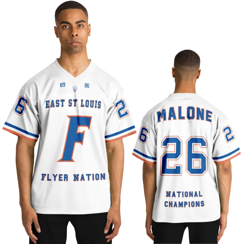
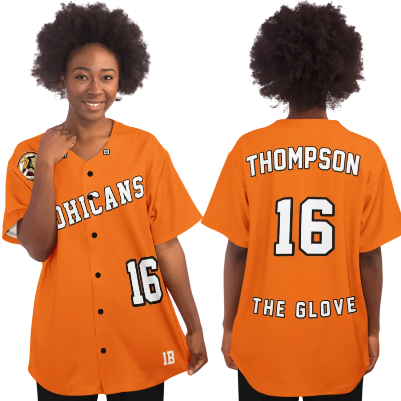
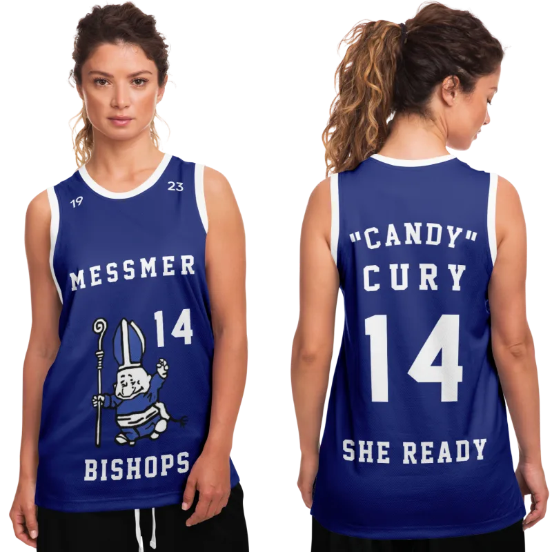
This element is consistently underestimated, and it produces the most visible sense of wrongness when it's off. Some programs used full last name only. Some used first initial and last name. Some used a nickname that appears nowhere in any official record but that everyone who was there will recognize the moment they see it.
The name configuration on your finished jersey is a choice about which version of you is being represented. Your full legal name is a different statement than the name your teammates used. Both are legitimate. The emotional era you identified in the first section will almost always tell you which one belongs here.
A Practical Decision Framework for the Former Athlete
The emotional work above tells you what you're designing. This section tells you how to translate that into actual design choices without getting lost in the available options.
Step 1: Lock the Era Before Opening the Design Tool
This sounds obvious. It is surprisingly rarely done. Most people open a design interface and let the available options shape their choices in real time. The result is a jersey that reflects what was available rather than what actually existed in the era they set out to capture.
Lock your era first — the year, the team, the specific version of the uniform — before you open anything. Write it down if that helps. "2009. Home uniform. Number 34. Dark base with gold trim. Last name only." That brief is your anchor. Every design choice gets evaluated against it. Options that don't match get ignored regardless of how good they look in isolation.
Step 2: Use Reference Images, Not Memory Alone
Designing a jersey for a former athlete from memory alone is the most common source of finished jerseys that feel slightly off and stay that way. Memory is emotionally accurate but visually imprecise. A single reference image — a team photo, a game-day shot, an old yearbook scan — is worth more than an hour of trying to reconstruct visual details from feeling.
You don't need high resolution. You need enough to confirm the color relationship, the number style, and the name configuration. A grainy newspaper photo from the era works. A picture on a former teammate's phone from a reunion works. The era you're designing from was a real time that produced real documentation. Find even one piece of it.
Kara M., 38, a former high school volleyball libero from central Ohio, spent the better part of an hour trying to recall whether her team's numbers had a white outline or a gold outline. Her younger sister found a single photo from a JV match in 2002 and sent it over. Gold outline, no shadow. The jersey Kara designed from that one image still hangs in her home office. She says it's the most accurate object she owns from that stretch of her life.
Step 3: Name Your One Compromise Before You Finalize
Almost every recreation of a past uniform requires at least one compromise. The exact font may not exist in a standard library. The regional school color may not have a clean standard match. The number style may need to be approximated from what is available rather than duplicated exactly.
The mistake is not making the compromise — compromises are sometimes unavoidable. The mistake is making one without naming it, then being quietly disappointed by the finished jersey without understanding the source of that feeling.
Name the compromise before you click finalize. "The font is close but not exact — I'm accepting that." "The blue is slightly brighter than I remember — I'm accepting that." When you name it, you own the decision. The jersey becomes the best achievable version of the truth rather than an imperfect accident you're left explaining.
When One Era Isn't Enough
Some athletes carried two eras that feel equally irreplaceable — the era where they grew into the game and the era where they peaked within it. These are sometimes separated by a position change, a transfer, a new coaching staff, or the specific chemistry of one extraordinary season that stood apart from everything before and after.
If your senior year and your best season are genuinely in competition — not from indecision but because both legitimately represent something you are not willing to discard — the answer is not to force a choice. It is to design both, and to understand that they are not the same jersey serving the same function.
The best-season jersey is the private one. It lives where you see it daily. It is the reminder of what you were capable of at the specific peak of your athletic identity.
The senior year jersey is the communal one. It tells the full story — the team, the program, the complete arc — as much as it tells yours.
Two jerseys. Two distinct functions. No era lost.
Your jersey is still out there waiting.
Design yours in minutes and see your name and number exactly the way you remember it.
Frequently Asked Questions
What if I can't remember the exact details of my era's uniform?
Imperfect memory is the starting point for most recreations, not a disqualifier. Begin with what you know with certainty — your number, your team's primary color, your name configuration — and build outward. A single reference image from the era will resolve most remaining details. If no reference exists and memory is all you have, prioritize emotional accuracy over visual precision. A jersey that captures how it felt to wear the real thing is more valuable than one that misses the feeling while matching a font correctly.
How do I pick the right number if I wore different numbers across different seasons?
The number belongs to the era, not the other way around. Once you've identified your emotional era — the season that carries the specific feeling you want to preserve — the number from that season is the correct one. If you're still uncertain which era is dominant, notice which number you wrote down first when you were thinking it through. First instinct in number selection is almost always the accurate one.
Is it appropriate to design a jersey that combines elements from multiple eras?
Yes, with one condition: name the intention before you finalize. A deliberate composite — your best season's number with your senior year's team configuration, for example — is a conscious creative choice, not an inaccuracy. The risk is assembling a composite accidentally, through unresolved uncertainty rather than clear intent, and ending up with something that doesn't fully represent either era. If you're going composite, make that decision explicitly. The finished jersey will feel like yours rather than like a compromise that happened to you.
How do I know if I'm designing for the right era, or just the most recent one I remember clearly?
Recency and emotional weight are different things, and they don't always land on the same season. The test: when you imagine someone picking up your finished jersey and asking which season it's from, which answer feels most true to who you were as an athlete? Not the most recent season. Not the most decorated one. The one where you were most yourself on a field or court. That answer is your era.