

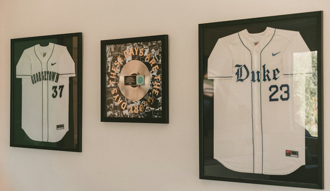
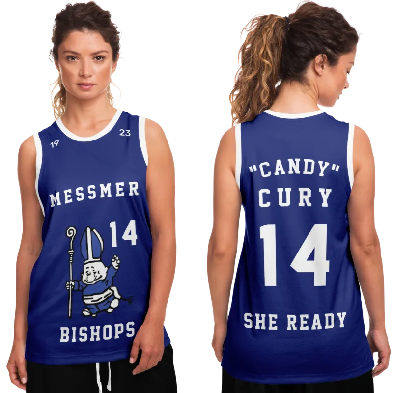
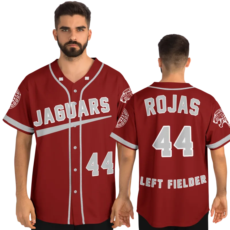
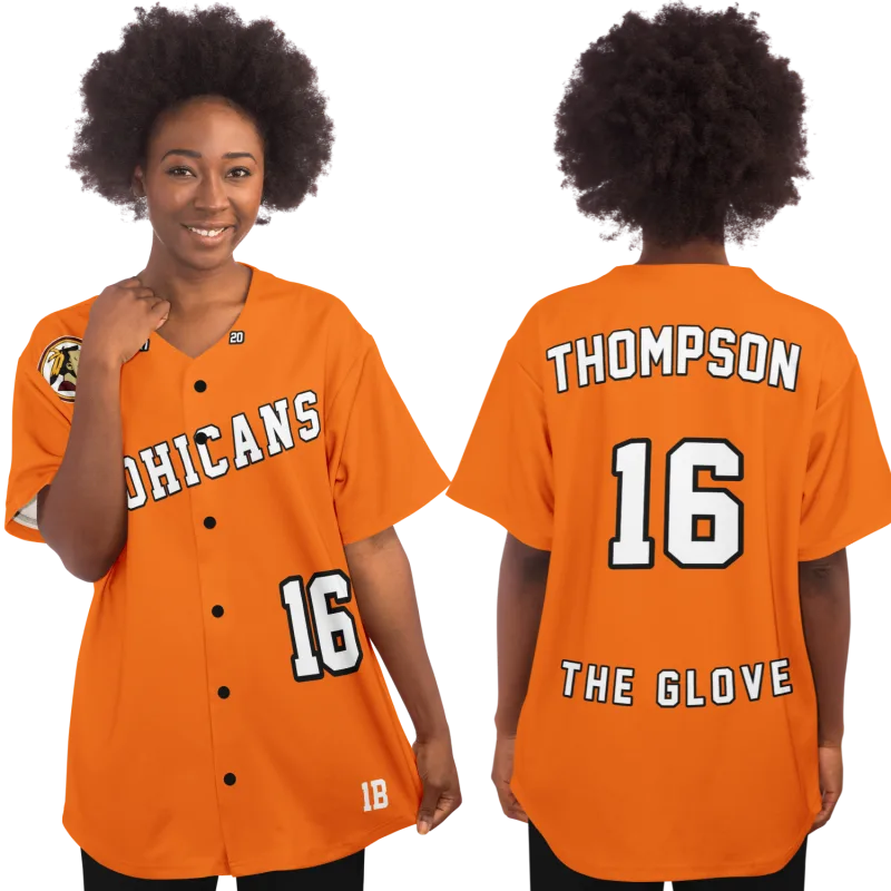
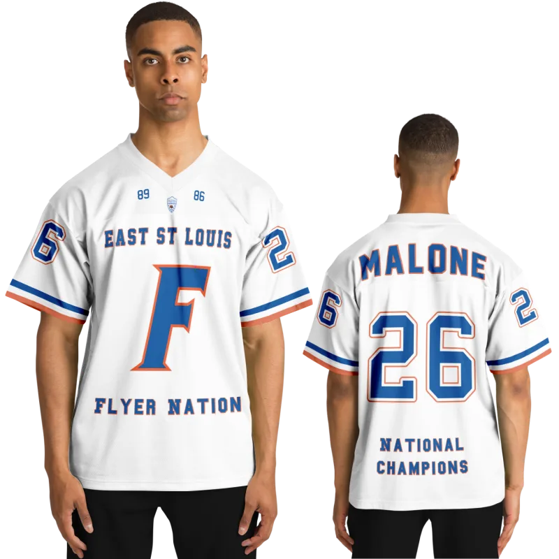
There's a specific moment that brings former athletes to this search.
You're watching a game — or scrolling through an old photo — and something clicks. The jersey in that image looks right in a way current designs don't. The number weight, the font, the way the mesh caught the gymnasium light. It's not just nostalgia. It's visual memory. Your body wore that design language for years, and some part of your brain catalogued every detail without being asked.
Throwback jerseys exist because that recognition is universal. Every former player carries a mental image of what their uniform looked like, and that image is always tied to a specific era. The problem is that most resources either list what's available to buy or treat jersey history as a fashion retrospective. Neither one answers the question a former athlete actually asks: What year did I play, and what did that look like?
This is the reference guide for that question. Decade by decade, this article maps the design language of each era — the fonts, materials, cuts, number weights, crest placement, and colorways that defined throwback jerseys from the 1970s through the early 2000s. Use it as a memory aid. Use it to verify what you remember. Use it to describe exactly what you want to bring back.
The 1970s: Heavy Fabric, Block Fonts, and the Last Era Before Synthetic
The seventies jersey is unmistakable the moment you pick one up. Weight is the first tell.
Uniforms of this era were constructed primarily from heavy nylon twill with wool-blend underlayers in colder-weather sports. Football jerseys in particular carried genuine heft — the kind that made you feel the uniform rather than forget it. Basketball jerseys ran lighter but still had a cotton-rich body that draped differently than any synthetic that came after.
The design vocabulary of the 1970s:
- Numbers: Thick, rectilinear block numerals with minimal taper. The stroke weight was heavy — often as wide as the number was tall at the crossbars. If your jersey number looked like it was drawn with a house-painting brush, you played in this era or inherited its visual grammar.
- Fonts: Proprietary block lettering with no decorative flourish. Teams used in-house lettering standards applied by felt-cut appliqué or chain stitching — no screen printing, no sublimation. The letters had physical dimension you could feel with your fingers.
- Colors: High-contrast primaries. This was the era of kelly green, burnt orange, and steel blue — colors chosen for visibility under stadium lighting, not broadcast television. The Pittsburgh Steelers' black-and-gold palette, which would eventually anchor some of the most recognized throwback jerseys in NFL history, was at its visual peak during this decade.
- Fit: Cut wide through the torso with a straight hem. No taper. The jersey was designed to sit over pads and equipment, which meant civilian wear looked shapeless by modern standards — but that shapelessness is exactly what makes the silhouette period-correct.
- Crest and logo placement: Centered chest for most basketball designs; left chest for baseball and many international football applications. NFL jersey numbers dominated the chest, with the team name arching over or below.
If you played organized youth or high school sports in the mid-to-late seventies, your jersey likely used letterpress-style screen printing on the numbers by the end of the decade — a transitional technique that blended the visual weight of twill appliqué with the production efficiency of printing. The edges of your numbers may have had a faint shadow or outline that wasn't quite clean. That imperfection is part of the era. It's worth preserving rather than correcting.
The 1980s: Synthetic Arrives, and So Does the Drop Shadow
The defining shift of 80s sports jersey style was material. Polyester mesh replaced cotton and nylon blends as the dominant fabric across nearly every team sport. The mesh of this era had a specific open-weave structure — large enough that you could see light through it, but uniform enough that it held printed numbers flat without distortion. If you held a jersey up to a window and it looked like a screen door, that's the mesh you're remembering.
What made the 1980s jersey instantly recognizable:
- Number construction: Screen-printed numbers with a prominent drop shadow — typically a secondary team color shifted two to four points down and right of the primary numeral. This was not subtle. The shadow was the design. It gave flat-printed numbers the visual depth that twill appliqué had provided through literal physical layering. If your jersey number looked three-dimensional from the bleachers, you played in this era.
- Striping: Horizontal chest stripes and sleeve stripes became a primary design element. The kelly green body with silver-white shoulder striping that defines the Philadelphia Eagles throwback jersey look from this period is so specific to the decade that it reads as 1980s even stripped of all other context.
- Name bars: The player name bar across the upper back — in matching drop-shadow font — became standardized in professional leagues during this decade and filtered into high school uniforms by the mid-eighties. If you had your name on the back for the first time, it was probably a polyester mesh jersey with a shadow font.
- Colors: Television production drove a shift from pure primaries toward slightly desaturated, broadcast-friendly palettes. The kelly green of the seventies began migrating toward forest and midnight green in football; the pure golds shifted toward more yellow-adjacent tones. This is why the same team's jerseys from 1978 and 1988 look like different colors in photographs — they were.
The NBA's later embrace of hardwood-era aesthetics drew heavily from 1980s design templates. The Philadelphia 76ers throwback jersey configurations from this era — specifically the red-white-blue striped designs with block lettering — became the reference point for what "classic NBA" looks like to an entire generation of fans and former players.
The collar construction of this decade is another reliable dating detail. The V-neck with a reinforced knit collar inset was dominant. Some basketball designs used a scoop neck with binding tape. The collar taping color — often a contrast — is a small but specific detail that places a jersey squarely in this decade.
The 1990s: Gradients, Teal, and the Era That Went All the Way
You know immediately when you're looking at a 90s sports jersey style design. Something about it is trying. That trying is not a criticism — it is the entire point.
The 1990s were the first decade in which jersey design became a conscious aesthetic project rather than a functional uniform decision. The arrival of dye-sublimation printing — a process that bonded ink directly into polyester fibers rather than printing on top of them — meant that for the first time, there was no technical limit on color gradient, pattern complexity, or the number of colors a jersey could incorporate. Designers used every bit of that freedom.
The 1990s design vocabulary:
- Gradients: A color that began as one tone at the shoulder and transitioned to a second tone at the hem. This was technically impossible before sublimation and immediately became the decade's signature effect. The transition point — where teal became navy, or purple became gold — is the specific visual detail that dates a jersey to this era with no ambiguity.
- Teal, purple, and black: New franchises of the early-to-mid nineties introduced color palettes specifically chosen for merchandise appeal. The Seattle Seahawks throwback jersey designs from the early nineties use a specific combination of teal, navy, and silver that is so particular to that moment that it has since been retired and re-released as a heritage design. The seahawks throwback jerseys in that colorway are among the most requested vintage NFL tributes precisely because that palette exists nowhere else in professional sports.
- Number fonts: Where the eighties used rectilinear block numerals, the nineties introduced angular, beveled, and compressed fonts. Numbers got narrower and taller. Some designs added an internal gradient to the numeral itself — the number's fill would shift color from top to bottom. The Spurs throwback shirt designs from this era use a specific fishtail font on the SPURS wordmark that is immediately identifiable as early-nineties NBA.
- Cut: Shorter and boxier in basketball — the shorts got longer and the jersey got shorter to match. Football jerseys began to taper slightly through the waist for the first time, anticipating the compression era that followed.
- Manchester United's 1990s designs: The home jersey of this era used a mandarin band collar in white that became as much a part of the club's visual identity as the red body. The Manchester United retro jersey configurations from this decade are recognized internationally, partly because of that collar detail and partly because the European campaign broadcasts of the mid-nineties gave those designs global saturation.
Marcus T., 44, grew up playing AAU basketball in Sacramento in 1993 and 1994. When he came to iPlayedFor, he described his jersey in three words: "teal, number 34, faded." What he was remembering was the sublimated gradient — the way the color had migrated at the edge of his number after repeated washing. That migration pattern is specific to the dye-sublimation process of that era. His jersey was correct for 1993.
The nineties also introduced the first widespread use of mesh panels alongside solid-body panels in the same jersey — a construction detail that showed up in both basketball uniforms and volleyball jerseys. If your jersey had one fabric on the chest and a different, more open-weave fabric at the sides, you played in the nineties.
The 2000s: Microfiber, Compression, and the Clean Slate
The 2000s sports jersey style represents the decade when performance displaced aesthetics as the primary design driver. The fabrics of this era feel different from every decade before — lighter, smoother, almost imperceptibly thin. If you held a jersey up to the light and saw almost nothing through it despite it being lightweight, you're holding a microfiber or moisture-wicking polyester from this period.
What defines the 2000s jersey:
- Microfiber and moisture-wicking polyester: The fabric has a slight sheen in direct light — not the matte finish of eighties mesh or the dimensional texture of nineties sublimation. It moves with the body in a way earlier fabrics didn't, and it dries in minutes. This is the jersey you wore and forgot you were wearing.
- Number font: A return toward cleaner, less expressive letterforms. The compressed angular fonts of the nineties gave way to slightly rounder, more neutral typefaces — particularly in basketball. The numbers got wider and shorter relative to the decade before.
- Sublimation continued, but restraint returned: The gradient approach of the nineties gave way to cleaner color blocking. The design vocabulary became more architectural — large color fields separated by clean lines rather than by gradients or patterns.
- Mitchell & Ness throwback jerseys entered mainstream culture: The Philadelphia-based manufacturer had been producing vintage-inspired jerseys since the 1980s, but it was the early 2000s when mitchell and ness throwback jerseys crossed from collector's items into mainstream fashion. This matters for identifying your era: if you remember seeing throwback jerseys in contexts outside of sports — in music videos, in streetwear — you're placing that memory in 2001–2007. The mitchell & ness throwback jerseys of that moment were largely drawing from 1970s and 1980s designs, which is why those decades' visual vocabulary became newly visible during your playing years.
- NFL throwback jerseys as broadcast event: The NFL's formal throwback uniform program — where teams wore historically accurate alternate jerseys for selected games — was well-established by the mid-2000s. If you watched games in this era, you saw NFL throwback jerseys in direct side-by-side comparison with modern designs. That comparison is why so many players who came up in this decade have a specific visual memory of historical jersey design: they watched it every fall.
- Eagles throwback jersey: The Philadelphia Eagles throwback jersey worn during the kelly green throwback games of this period became the reference image for what "Eagles throwback" means to an entire generation. The kelly green body, the white numbers with black outlines, the specific shoulder stripe configuration — that combination is what players from this decade associate with the word throwback, regardless of what team they played for.
Reading Your Own Jersey: The Four Design Details That Date Any Uniform
Regardless of decade, four specific design elements will tell you approximately when a jersey was made.
-
Number construction method: Twill appliqué (pre-1985) → screen print with drop shadow (1980s–early 1990s) → sublimated gradient or dimensional font (mid-1990s) → clean sublimation on microfiber (2000s onward). Feel the edge of the number. A raised edge means twill or tackle twill. A flat edge means printed.
-
Mesh size and body: Large open-weave mesh = 1980s. Patterned or geometric mesh panel alongside a solid body = 1990s. Uniform micro-texture with visible sheen = 2000s. Heavier, cotton-adjacent body = 1970s or earlier.
-
Font weight relative to number height: Heavy stroke weight, low height-to-width ratio = 1970s. Drop shadow with medium stroke weight = 1980s. Narrow, tall, angular = 1990s. Wider, cleaner, medium weight = 2000s.
-
Color palette:
- Pure primaries, high contrast = 1970s
- Slightly desaturated primaries, shadow accent color = 1980s
- Teal, purple, gradient secondary colors = 1990s
- Cleaner color blocking, neutral secondaries = 2000s
In our experience working with former athletes on their jersey designs, the most common identification error is placing a mid-nineties jersey in the early 2000s because the colors read as "modern." The tell is always the fabric and the number font. Modern fabrics don't have the dimensional quality of nineties sublimation, and nineties fonts don't carry the clean neutrality of 2000s design. Put those two details together and you can date a jersey within about five years.
One more detail worth noting: the retired number tradition — in which a franchise permanently removes a specific number from circulation to honor an exceptional player — has made certain jersey numbers culturally significant across decades. If you wore one of those numbers during your playing years, you carried a weight you may or may not have known about at the time. That history belongs to your jersey too.
Your jersey is still out there waiting.
Design yours in minutes and see your name and jersey number exactly the way you remember it.
Frequently Asked Questions
Why do jerseys have numbers?
Jersey numbers were introduced in professional and collegiate sports primarily to help spectators, broadcasters, and officials identify individual players from a distance. The practice became standard in American football in the 1920s and in basketball and baseball through the 1930s. Over time, numbering systems became sport-specific — with NFL rules assigning number ranges by position — so the number itself communicates role as well as identity. The retired number tradition, in which a franchise permanently removes a specific jersey number from circulation to honor an exceptional player, elevated jersey numbers from functional identifiers to permanent records of a career.
What are jersey numbers for beyond identification?
Beyond identification on the field, jersey numbers carry positional meaning, cultural history, and personal significance that outlasts any single season. In many sports, your number is assigned by position range — quarterbacks in one band, linemen in another. In others, it's chosen freely, which is why the same number can mean completely different things across two teammates. For former athletes, the jersey number is often the most specific detail they remember about their playing years — more specific than the team name, more specific than the colors. It's the number their coach called, the number on the scorebook, the number their family looked for in the stands.
What is a jersey number, and does a jersey have to have one?
A jersey number is the numeral displayed prominently on the front and back of an athletic uniform to identify the wearer during competition. In organized play, jerseys are almost always required to carry numbers — most governing bodies at the scholastic, collegiate, and professional level mandate numbered uniforms for officiating purposes. Recreational and pickup leagues may not enforce this requirement, and fashion or memorial jerseys exist without numbers, but any jersey designed for actual competitive play is expected to carry a number on both the front chest and the upper back.
What jersey number should I choose when designing a throwback?
Your own number is always the right answer. The entire premise of a throwback jersey is that it honors your playing experience. The number you wore — whether it was assigned by your coach, chosen at registration, or the number your older sibling wore before you — is the specific detail that makes the jersey yours rather than a tribute to someone else's career. If you wore multiple numbers across different seasons or sports, the number from your most significant season, your best team, or your first organized uniform will typically feel most correct. There's no wrong answer, but there is always a your answer.
How do Mitchell & Ness throwback jerseys differ from jerseys designed around your own playing years?
Mitchell & Ness throwback jerseys are licensed designs built around specific professional teams and seasons — they are tributes to franchise history, not personal history. A jersey designed around your own playing years uses the design language of your era — the fonts, fabrics, colorways, and number styles of the decade you played in — applied to your name, your number, and your team. The former is about professional sports heritage. The latter is about yours. For most former athletes, the second option is the one that actually means something.
See also: what to do with your old varsity letter jacket | personalized sports gifts vs generic options | jersey sizing numbers like 44, 48, and 52 explained | custom softball jerseys built around your alumni game era | the psychology of why high school sports still matter to adults