
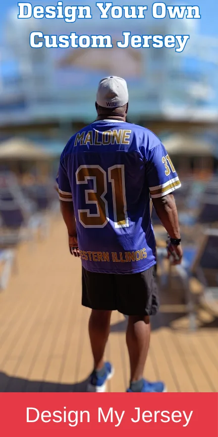
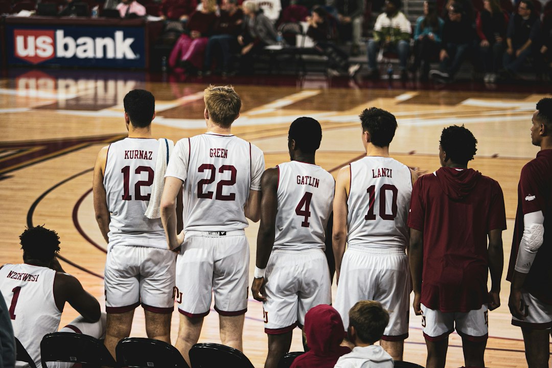
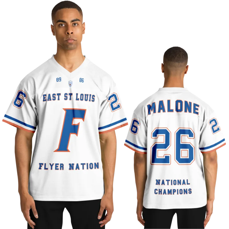
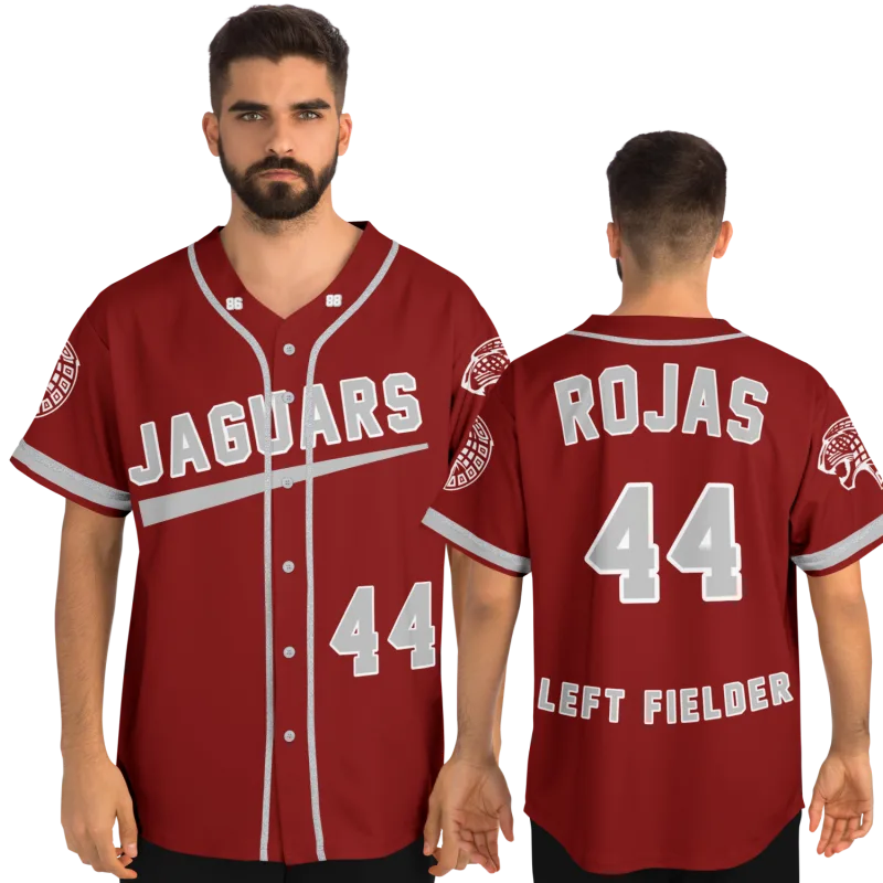
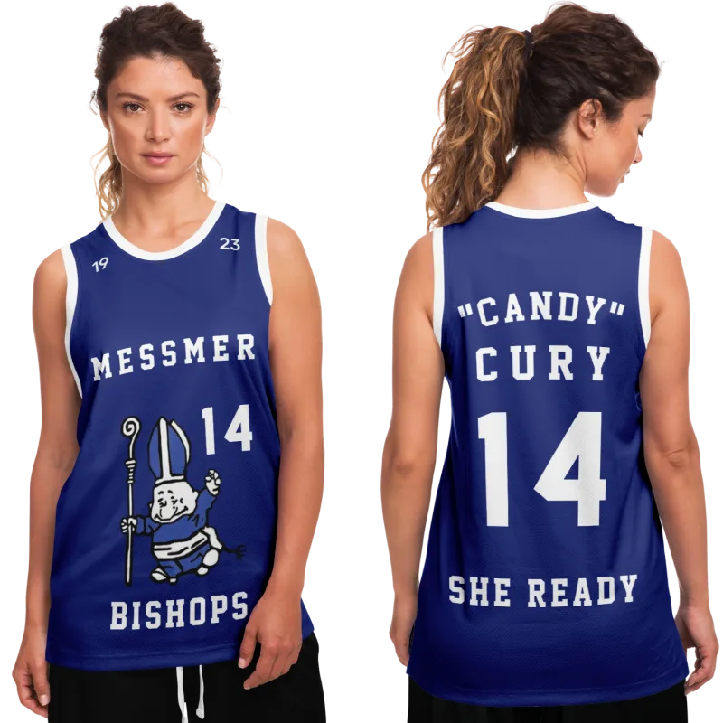
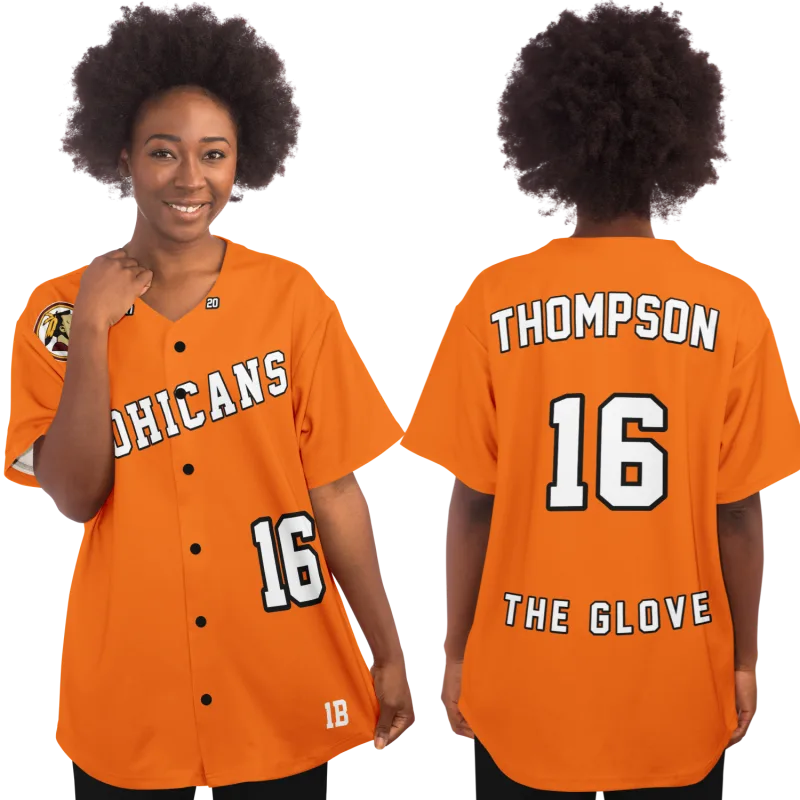
You have one photo. It is a scan pulled from a yearbook page, the resolution is somewhere south of useful, and somewhere in the frame is a younger version of you — mid-dribble or caught in a team-photo pose — wearing a jersey you had not thought about in two decades until right now.
That photo is not a sentimental obstacle to your basketball jersey design. It is the entire design brief. The color, the font, the number treatment, the stripe detail — every specification you need is locked inside that image. The only question is how to extract it, translate it into something a custom jersey builder can actually use, and walk away with a finished piece that honors the original.
No top-ranking guide explains how to do that. This one does.
What follows is a complete, step-by-step process for rebuilding a custom basketball jersey from a yearbook photo — including how to pull a real color hex code from a low-resolution scan, how to identify a font family from letterforms alone, and how to work around the compression artifacts and yellow cast that make 1990s photography so uncooperative.
By the end, you will have a design brief precise enough to submit to any basketball jersey design maker and confident enough to approve without second-guessing the result.
What a Yearbook Photo Actually Contains — More Than You Think
The first instinct when you look at a grainy scan is to feel like the information simply is not there. That instinct is worth challenging before you do anything else, because it shapes how you approach every step that follows.
Yearbook photography from the 1980s and 1990s originated on actual photo paper. The original image held far more color fidelity and detail than a digitized scan suggests. The yellow cast you are seeing is an artifact of paper aging and scanner calibration — it is not evidence that the color information is gone. The blur is JPEG compression introduced during digitization, not blur in the source photograph. Both problems are correctable with tools that are free and require no design background.
What the photo actually contains, even at low resolution:
- The relative relationship between colors. You may not be able to read the precise hex value of your team's royal blue directly, but you can tell it sits distinctly apart from navy, reads warmer than cobalt, and carries roughly the same saturation density as a classic New York Knicks-style blue. That relative information is sufficient to locate the actual hex through cross-referencing.
- The proportions of the letterforms. Even at 72dpi you can see whether the letters are condensed or wide, whether the serifs are slab-cut or bracketed, whether the crossbar of the A rides high or low. Those proportions survive resolution loss and are identifiable.
- The spatial layout. Number placement, wordmark positioning, stripe geometry — these are relational details that compression cannot fully destroy.
The readers who get the best results from this process are the ones who stop trying to zoom into the blurry areas and start treating the photo as a reference document rather than a finished image. The photo tells you what to look for. The research that follows locks it in.
Step 1 — Prepare the Photo Before You Extract Anything
Before sampling a single color or analyzing a single letterform, invest five minutes in producing the best working version of the image. Every subsequent step becomes more accurate as a result.
What you need: Any image editing application. Google Photos, Apple Photos, Canva's free tier, or the free web version of Adobe Express all work. Photoshop is not required.
Three adjustments, applied in this order:
-
Correct the yellow cast. Move the temperature or white balance slider toward cool or blue until the whites in the frame — the gym wall, any white panel on the uniform, court markings — read as white rather than cream. Stop at that point. The goal is not an attractive photo; the goal is uniform colors that sit closer to their original values.
-
Add moderate contrast. A contrast increase of +20 to +30 on a standard 0–100 scale sharpens the boundary between color blocks and makes letterform edges easier to read. Do not push further — excessive contrast on a low-resolution source image crushes shadow detail and introduces noise that makes color sampling less reliable.
-
Export at the largest available size. Some scanning applications allow re-export at a higher interpolated resolution. Use that option. Additional pixels, even synthetic ones, give you a larger and more stable canvas to sample from.
Save this corrected version under a new filename. Keep the original untouched. All sampling and font analysis from this point forward uses the corrected copy.
Step 2 — Sample the Color Hex Code for Your Basketball Jersey Design
This is the step most custom basketball jersey guides omit entirely, and it is the single most valuable action you can take before submitting a design order.
Every team uniform color has an exact hex value. A significant number of high school and collegiate programs used official Pantone color standards that mapped directly to documented hex codes — and those standards have been archived by athletics branding databases and fan community records for decades. Your goal is to get close enough through photo sampling that you can confirm the match against one of those existing references.
The sampling process, step by step:
- Open your corrected photo in any tool that includes an eyedropper or color picker — Canva, Adobe Express, and Google's built-in image tools all include one.
- Click the eyedropper on the flattest, most evenly lit patch of the jersey's primary color. Avoid shadowed areas and highlights. You want the most neutral read the image can give you.
- Record the hex code the tool returns. It will not be a clean read — residual cast and compression noise affect it — but it will land in the right general range.
- Open a hex color picker (Google's built-in tool works; search "hex color picker") and note the hue value specifically. Hue is the most stable dimension across lighting conditions and compression artifacts — far more stable than saturation or brightness.
- Cross-reference the hue against known team color documentation. A sample returning hue 220° at high saturation places you in the range of classic royal blue — which runs between approximately #0057B7 and #2563AB depending on the specific program. A hue reading closer to 210° points toward Columbia blue or powder blue. That distinction is visible and meaningful on a finished jersey.
From there, search your state's high school athletics association color standards online, or look up whether your school's colors were ever registered with an athletic conference. Many state associations required Pantone-specified uniform colors from member schools, and those specifications remain archived. This converts your approximate sample into a confirmed reference point.
Step 3 — Identify the Font Family From the Letterforms
Basketball jersey typography from the late 1980s through the early 2000s drew from a surprisingly compact set of font families. That concentration works to your advantage.
You do not need to read the font at high resolution. You need to identify three things:
1. Width classification. Are the letters on your jersey condensed — noticeably taller than they are wide — standard proportion, or expanded? Condensed fonts dominated basketball uniform typography throughout this era. Teams needed to fit multi-digit numbers onto a limited chest area, and condensed fonts solved that problem cleanly. If the numbers on your jersey read as clearly taller than wide, you are almost certainly looking at a condensed variant.
2. Serif or sans-serif. Examine how the strokes terminate. Do they end in flat horizontal bars (serif) or clean cuts (sans-serif)? Basketball uniforms from this period split roughly 60/40 between condensed sans-serif numbers and slab-serif block lettering. A design inspired by the Chicago Bulls basketball jersey of the 1990s, for example, used a modified block serif — if your team's uniform referenced that aesthetic, the slab serifs will be visible. A design in the style of the Phoenix Suns basketball jersey from the same period used a rounded sans-serif. The difference is readable even at low resolution.
3. The specific character shapes of A, R, and G. These three letters carry the most distinctive variation across font families. Even in a compressed image you can typically determine: whether the crossbar of the A is horizontal or angled, whether the leg of the R kicks outward or falls straight, and whether the tail of the G loops back or terminates flat.
With those three observations recorded, go to WhatTheFont, upload a cropped section of your corrected photo showing only the jersey lettering, and review the returned candidates. You will typically see four to six suggestions. The right answer is almost always the one that satisfies all three of your letterform observations — not simply the one with the closest overall silhouette.
The font families that appear most frequently in basketball uniform design from this era:
- Collegiate Block and its variants — the dominant choice for number sets across the country
- Futura Condensed Bold — popular for wordmarks, particularly in programs that wanted a modern geometric look
- Franklin Gothic Condensed — widely used in Midwest and Southern programs through the 1990s
- ITC Machine — the geometric, hard-angled font family behind the classic Orlando Magic basketball jersey wordmark; recognizable by its mechanical squared letterforms and even stroke weight
Step 4 — Read the Layout Structure and Stripe Details
Color and font are the hardest elements to extract from a yearbook photo. Everything that follows — layout structure, stripe placement, number sizing — is comparatively straightforward, because spatial relationships survive compression better than color accuracy does.
Working through the layout:
Move from the outside in. Begin with the overall silhouette: sleeveless, with or without side panels, with or without shoulder inserts. Then identify the largest color blocks — primary body color, side insert color, trim color. Then number placement: centered on the chest, elevated, or dropped low. Then the team name or wordmark: positioned above the number, below it, curved or straight. Finally, stripe detailing on the sides, shoulders, or hem.
Estimate proportions relatively rather than absolutely. The side stripe on a basketball jersey typically falls into one of three width ranges relative to the side panel: narrow (roughly one-quarter of the panel), medium (roughly one-third), or wide (filling most of the panel). You can identify which category applies without any measuring tools.
Sketch the layout on paper before opening any basketball jersey template tool. A rough diagram — sixty seconds with a pen — that captures color block positions, stripe locations, and approximate proportions gives you a fixed reference to consult while working in a design tool. Keeping that sketch visible eliminates the constant back-and-forth between the photo and the builder.
A Design Brief in Practice
Marcus T., 44, had a single grainy scan from his 1997 varsity yearbook page and nothing else. His high school had merged with another district years earlier, the original uniforms were long gone, and the athletic department had no color records on file. He worked through this exact process — sampling the jersey's primary color, cross-referencing the hue reading against his state's historical conference color standards, running a cropped letterform image through WhatTheFont — and came back with a confirmed hex code, a font identification, and a hand-sketched layout diagram. Two design revisions later, he had a finished custom basketball jersey for his rec league team that everyone immediately recognized as a tribute to the original. His teammates now call it the tribute kit. That framing is exactly right.
Step 5 — Build the Design Using Your Completed Brief
With a confirmed hex code, a font identification, a layout sketch, and your stripe specifications documented, you now have more information than most custom basketball uniform design tools require to produce an accurate result.
Open a basketball jersey design maker and select the base silhouette that most closely resembles your original. The template does not need to be an exact structural match — it is a starting point. What matters is that the platform allows you to:
- Input a custom hex color code rather than selecting only from a preset palette
- Choose from an extended font library or upload a font file directly
- Adjust stripe placement and width independently of the color block layout
If a builder does not support custom hex input, it cannot reproduce your original colors accurately. Use a different platform.
Apply your specifications in this sequence: base color first, then secondary and trim colors, then font selection and number entry, then wordmark or team name text, then stripe details. Working in this order means each layer visually confirms the one before it. If the base color reads wrong, you catch it before investing time in the typography layer.
Before submitting the order: Export a proof image and open it alongside your corrected yearbook photo at the same screen size. The eye catches proportion and color discrepancies at a glance that the brain misses when switching between tabs.
Platforms that offer nike basketball jersey custom options and rep-assisted service for custom nike basketball uniforms are worth considering when your design includes complex stripe geometry or non-standard font requests. Provide your brief in writing and attach the corrected photo — a designer working in professional tools will get closer to the original spirit of the uniform than a self-service template alone can deliver.
Three Points Where This Process Breaks Down — and How to Fix Each
The sampled color looks correct on screen but prints differently. Screen display uses RGB. Jersey production uses CMYK or Pantone ink. When submitting a hex code, ask the manufacturer to confirm the CMYK or Pantone equivalent before the order goes to production, and cross-reference against a physical swatch if one is available. The gap between a #003DA5 royal blue and its CMYD equivalent can be significant under gymnasium lighting — worth resolving before production, not after.
The font looks right in the design tool but reads differently on the finished jersey. This happens when a builder substitutes a visually similar but technically distinct font during file preparation. Specify your font selection in the written order notes — not only in the design interface — and request a typography proof before full production begins.
Narrow stripes in the builder disappear or thicken on the physical jersey. Stripe widths below approximately half an inch frequently compress or vanish during fabric sublimation. If your original design carried narrow side stripes, go slightly wider in the design tool than the reference appears to call for. The physical result will read more accurately to the eye on court than the proof image suggested.
Your jersey is still out there waiting.
Design yours in minutes and see your name and number exactly the way you remember it.
Frequently Asked Questions
How do I design a basketball jersey if my yearbook photo is black and white?
A black-and-white photo removes direct color information but preserves everything else. Use it to document layout structure, font letterforms, stripe placement, and number sizing — all of which are legible in monochrome. For color, cross-reference your school's known palette through alumni networks, state athletic association archives, or the school's current branding standards. Many programs have maintained consistent color identities across multiple decades. Confirm the specific hex or Pantone value through one of those sources before placing any order.
How do I design custom basketball uniforms for a full team from a single yearbook photo?
The photo gives you the design specification — the template that all jerseys in the set share. Once you have confirmed the hex codes, font family, and layout from the process above, that brief applies to every size in the order. Submit the same specification for the full run and confirm that the manufacturer applies consistent color calibration across all pieces. Color variation between individual jerseys in a production batch is a documented quality-control issue in custom uniform manufacturing; request a written batch color-consistency commitment before the order moves to production.
How to design a jersey when the original used a custom or licensed font I cannot identify?
Many institutional fonts used by high school and collegiate programs in the 1980s and 1990s were drawn specifically for a uniform manufacturer and do not appear in any public font database. If WhatTheFont and manual letterform analysis both fail to return a usable match, find the closest commercially available font that shares the dominant visual characteristics of the original — width classification, weight, and serif treatment. The difference between a proprietary institutional font and a well-matched commercial alternative is typically undetectable at jersey-reading distance on a court.
Can I use a basketball jersey template to get started before finalizing my specs?
Yes — and doing so early is often the fastest way to validate your layout interpretation. Load a template that approximates your original silhouette and apply your base color. The visual of that color on the correct silhouette will tell you immediately whether your hex code is in the right range before you invest time in font selection and stripe work. Use the early template stages as a confirmation tool for your brief rather than a final design environment.
What is the difference in basketball jersey design between recreational and competitive play?
The design process is identical. The difference is fabric specification and construction standard. Recreation league jerseys typically use single-layer polyester or mesh with sublimated graphics. Jerseys intended for sanctioned competitive play may require specific fabric weights, reinforced stitching at stress points, and in some cases embroidered rather than printed numbering to meet association standards. Specify your intended use level when submitting your order so the manufacturer applies the appropriate construction standard to the design you have documented.
See also: personalized sports gifts vs generic options | jersey size chart to find your fit | custom sports shadow box to display alongside it