
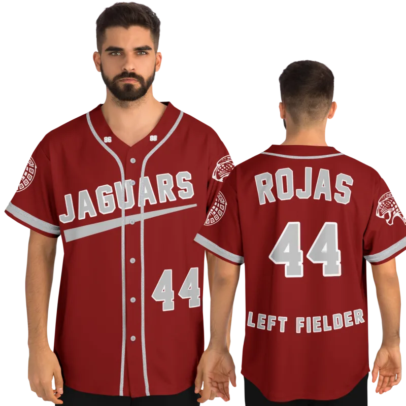
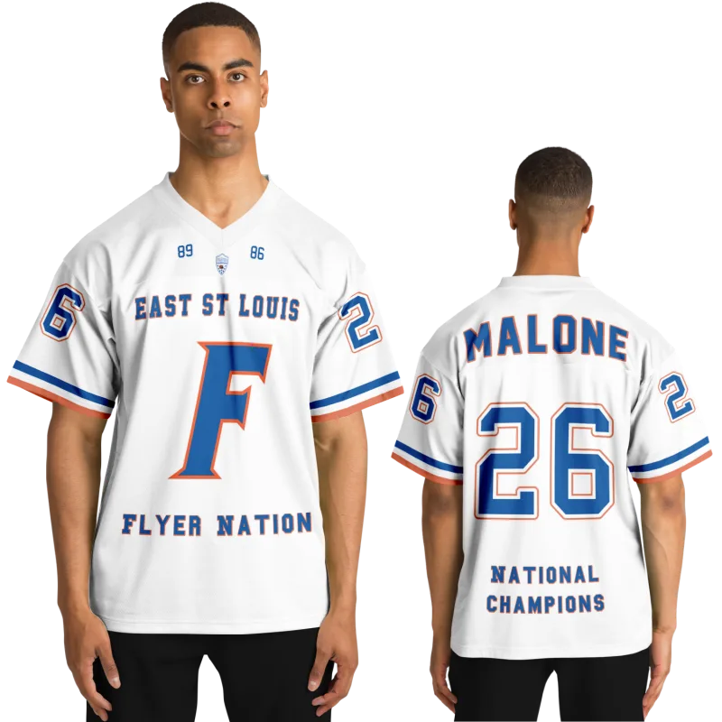
You remember the specific weight of the fabric across your shoulders. The way the piping tracked the sleeve seam — a single thin stripe or a bold double-color band the program had used for thirty years. The chest lettering: arched or straight, block or script, how many finger-widths it sat below the collar. You didn't choose any of it. It was handed to you in a locker room that smelled like pine tar and August heat. And it was, without question, yours.
Now you're on the other side of that equation. You want to design custom baseball uniforms — for your rec league, your kid's travel team, your alumni game, or just for yourself, because some things deserve to be recovered. You're staring at a design tool with a color picker and a font dropdown, wondering why the result looks close but never quite right.
What's missing isn't the colors. Colors are obvious. What's missing is the vocabulary of decisions — the ones that separated one program's look from every other, the ones that told you what era a team played in just by studying a photograph. This article gives you that vocabulary back. The specific design choices that former players recognize immediately, that turn a jersey order into something that feels like it came from a real program — because you built it the way real programs actually build them.
What Design Tools Don't Ask You — But Should
Most online uniform builders are organized around the visible: pick your color, pick your font, type your name and number. Those decisions matter. But they're the last 20% of what makes a uniform feel authentic. The first 80% lives in decisions that most builders bury three menus deep — or skip entirely.
Here's what the tools rarely surface, and what former players clock first when a uniform looks right or wrong.
Placket Width and Button Configuration
The placket — the fabric strip running down the center front of a full-button jersey — is one of the most era-specific elements in baseball uniform design. Narrow plackets with small buttons read as the late 1970s through the mid-1980s, when most programs were tracking professional trends closely. Wider plackets with larger buttons feel more contemporary. Some programs used a hidden-button design for a decade before switching; the button configuration alone can date a photograph.
The first question worth asking when you design your jersey: what button configuration matches the era you're trying to capture? If your program wore double-knit pullovers in the 1990s, a wide-placket full-button design is already historically wrong for the look you're after. If you played in the 2010s under a coach who modernized the program's identity, a snap-front or half-button configuration might be exactly right.
The distinction matters for rec leagues too. A full-button jersey reads as a classic nine. A two-button henley reads as a training garment. Know which one you're building before you pick a single color.
Piping: Thickness, Color Count, and Where It Stops
This is where former players get specific fast. Piping carries more program identity than almost any other single element. The decisions stack:
- Single color vs. double color: A single stripe in the team's secondary color is understated and classic. A double stripe — team color sandwiched around a contrasting accent — signals a more complex visual identity, and reads differently depending on whether that accent is white, black, or a third program color.
- Thickness: The difference between 1/4-inch piping and 1/2-inch piping is significant at game distance. Thinner piping is more traditional. Thicker piping tracks to a 1990s-era influence, when programs borrowed from the color-heavy aesthetic of that decade's professional uniforms.
- Placement logic: Does the piping run the full sleeve seam, stop at the shoulder, or appear only at the collar and cuff? Programs that used piping exclusively at the collar and cuff created a different silhouette than those that ran it the full length.
The great professional uniforms that former players grew up watching established these as meaningful distinctions. The classic pinstripe design of Yankees baseball jerseys uses no piping at all — the vertical stripe is the design element. The Dodgers' road gray carries a single blue sleeve stripe at a width that has stayed consistent for decades. When you're designing your own uniform, the professional model closest to your program's aesthetic gives you a reliable reference for what "right" looks like in your context.
How to Design Baseball Uniforms: Number Fonts, Lettering, and Era Logic
Chest lettering and number fonts are the most visible design elements on any baseball uniform. They're also the most frequently genericized by design tools, which default to a small library of "baseball fonts" that may or may not match what your program actually wore.
Chest Lettering: Arch, Straight, Script, Block
The architecture of the chest lettering signals which design tradition a program was working in:
Arched block lettering — curved upward across the chest — is the traditional professional model, carried forward from the earliest decades of organized baseball. Straight block lettering — horizontally flat — became more prevalent during the pullover-uniform era of the 1970s and 1980s, when double-knit fabric changed what lettering could do. Script lettering is its own tradition entirely. The script across a San Francisco Giants jersey carries a different emotional register than block "GIANTS" does. The mets baseball jersey script has a distinctive curve that fans recognize the moment they see it. Shadow and outline fonts — where the primary letter color is surrounded by a contrasting shadow — add visual depth and were particularly popular in the 1990s, when programs wanted a more dimensional look.
When you design baseball uniforms for a team or for yourself, the choice between these isn't just aesthetic preference. It's a statement about which tradition the uniform draws from. A script chest on a uniform with clean, minimal piping makes a different visual argument than block lettering on a uniform with bold double-stripe piping. The decisions have to talk to each other.
Number Placement and Font Weight
Number placement is an era marker most people overlook. High-on-the-back placement — the number sitting well above mid-back — was standard through the 1960s. Lower placement became more common as uniform cuts evolved. On the front, some programs used a small chest number on the left; others used no front number at all; others used a large front number that matched the back in full.
Font weight matters equally. Thin-stroke numbers feel traditional and refined. Thick-stroke, high-contrast numbers with heavy outlines read as a more assertive design identity — closer to what you see on a Chicago White Sox uniform from a specific era, or the bold number presentation on Atlanta Braves jerseys during certain periods of their visual history.
In our experience, the right sequence is to decide your number font before you finalize chest lettering. The stroke weight of both elements needs to be consistent across the uniform. Mismatched weights between chest lettering and back number is one of the most common tells of an underdeveloped design — and one of the easiest mistakes to prevent by standardizing weights at the start.
Sleeve Patches and the Placement Logic Former Players Know Instinctively
Marcus T., 38, played four years of college ball in the mid-Atlantic and now coaches a 14U travel team. When he came to design custom made baseball uniforms for his program, the first thing he flagged was sleeve patch placement — specifically, the difference between a patch sitting at the cap seam versus one sitting two inches below the shoulder seam on the sleeve proper. He'd worn both on different teams. To him, the placement distance was as significant as the patch design itself. He was right.
Sleeve patch placement follows a specific logic:
At the cap seam — the patch sits at the very top of the sleeve, where sleeve meets shoulder. This placement is associated with older design conventions and creates a cleaner look on the sleeve body below it.
Below the seam — the patch sits on the sleeve proper, usually one to three inches below the shoulder seam. This placement became more common as patches grew larger and the cap seam location became too small to accommodate them cleanly.
Right sleeve vs. left sleeve — programs that used both a team patch and a league or tournament patch had to decide which went where. The professional convention puts commemorative patches on the left sleeve and league affiliation patches on the right, but programs often inverted this based on their specific uniform logic. Knowing which side your program used is the kind of specific detail that former players from that program will notice immediately — and get quietly wrong if they don't think it through.
If your custom jersey is going to carry a patch, place it with intention. "Default to left sleeve, two inches below the cap seam" is a reasonable starting rule. But if you're recreating a specific program look, check your memory against an old photograph before you commit.
Custom Baseball Uniforms: The Color Logic Real Programs Use
One of the things that separates a professionally designed uniform from a catalog order is system thinking — the recognition that home, road, and alternate uniforms from the same program need to follow shared design rules, even while varying in color and lettering.
The Home/Road Logic
Classic programs built their uniform system around a disciplined logic: home uniforms are white with team colors applied in lettering, piping, and trim. Road uniforms are gray with the same team colors applied in the same locations. Alternate uniforms introduced a color base — usually the primary team color — with contrasting lettering.
The constraint was consistency: same piping logic, same lettering style, same number font weight, same patch placement across all variants. What changed was the base color. What stayed the same was everything else. That's what made them a system rather than a collection of individual jerseys.
When you're building custom baseball uniforms for a team, this is the framework worth applying. Set your design rules first — piping thickness, lettering arch, number font weight, patch placement — and then apply those rules consistently across every uniform variant you're ordering.
The Four Decisions That Matter at the End
The difference between a rec league uniform that looks like a real program and one that looks like a catalog order isn't budget. It's decision quality. Here are the four decisions that matter most at the final design stage:
- Standardize your trim color count. Choose two colors — primary and secondary. Apply them consistently across lettering, piping, and number. A third accent color can work if it appears sparingly: outline only, or a piping accent only. Three full-presence colors almost always read as busy.
- Match your number font to your lettering font. They don't need to be identical, but they need to come from the same design family — same stroke weight, same overall character. A bold-slab chest letter paired with a thin-stroke back number is an immediate authenticity flag.
- Decide your piping before your lettering. Piping defines the uniform's silhouette at game distance. Lettering is read up close. Build the design from the outside in.
- Check your design on both white and gray base fabrics before you finalize. Colors shift against different bases. What works cleanly on home white may wash out or read too dark on road gray. If you're ordering one jersey, verify your color choices look intentional against both — even if you only order one.
Your jersey is still out there waiting.
Design yours in minutes and see your name and number exactly the way you remember it.
Frequently Asked Questions
What's the difference between sublimated and tackle twill lettering on a custom baseball jersey?
Sublimated lettering is printed directly into the fabric through a heat-transfer dye process — the lettering is part of the fabric itself, with no raised edge. Tackle twill lettering is cut from a separate fabric and sewn onto the jersey, producing a raised, textured look with a visible stitched border. Tackle twill is the traditional professional method; it holds its appearance over more wash cycles and reads more authentically at game distance. Sublimation is more cost-effective for full-color designs or for jerseys where the lettering includes gradients or complex graphics that can't be reproduced in cut fabric. For a uniform meant to look like a real program jersey rather than a tournament souvenir, tackle twill is generally the right call for numbers and lettering.
How do I choose the right fabric weight for a game-use custom baseball uniform?
Fabric weight is measured in ounces per square yard. Heavier fabrics — 6 to 8 oz — are more durable and hold their shape through a full season of sliding and washing, but they're warmer and less breathable. Lighter fabrics — 3.5 to 5 oz — perform better in heat and allow more range of motion, but they show wear faster and require more careful washing. Most current professional programs use fabrics in the 4 to 5.5 oz range, which balances durability with athletic performance. If you're designing for a travel team playing in summer heat, err lighter. If it's a fall rec league or the uniforms need to last multiple seasons, go heavier.
Can I recreate a specific era's uniform look without using licensed team designs?
Yes — and this is exactly what the best custom uniform designs do. The design elements that defined a specific era — piping thickness, placket configuration, lettering arch, number font weight — are not owned by any team. What's protected is the specific combination of colors, logos, and wordmarks that constitute a licensed identity. You can design a uniform with double-stripe piping, arched block lettering, and a pinstripe base without referencing any professional team's protected marks, because those are design conventions, not trademarks. The goal when designing custom baseball uniforms inspired by a specific era is to capture the visual language of that period — not to copy any specific team's registered identity. A skilled uniform builder can help you identify which elements are available and which require original application.
What sleeve patch size works best for a travel baseball program?
The standard sleeve patch size for most youth and adult travel programs is 3 inches in diameter for circular patches, or 3 × 2 inches for rectangular ones. At those dimensions, the patch reads clearly at the distance a spectator or opposing player would see it from — roughly 15 to 30 feet — without overwhelming the sleeve design. Larger patches, 4 inches and above, can work on adult jerseys but tend to look oversized on youth uniforms with smaller sleeve real estate. If your program patch includes fine detail — small text, intricate line work — test it at actual production size before committing to a full order. Detail that's clear on a screen at full resolution can disappear entirely in embroidered or woven production at small scale.
See also: personalized sports gifts vs generic options | custom softball jerseys follow the same emotional logic | athletic identity that doesn't disappear after high school | getting your jersey size right