
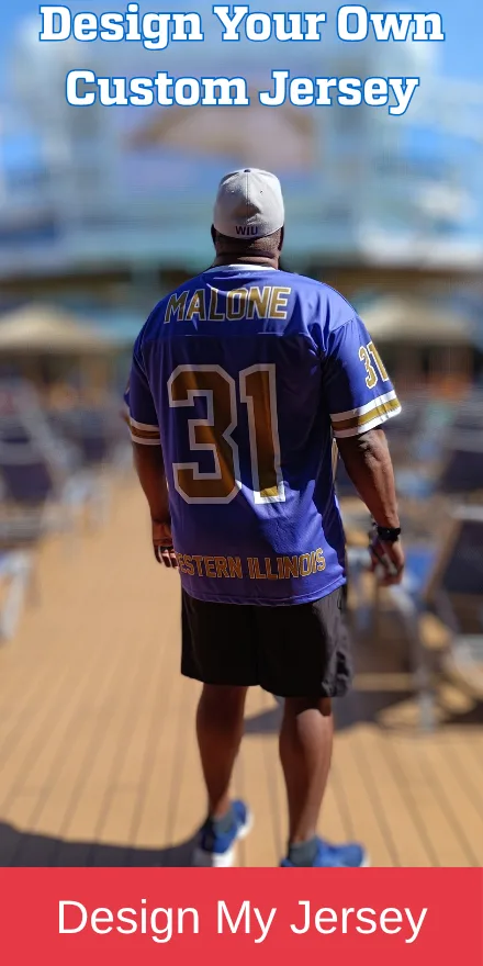
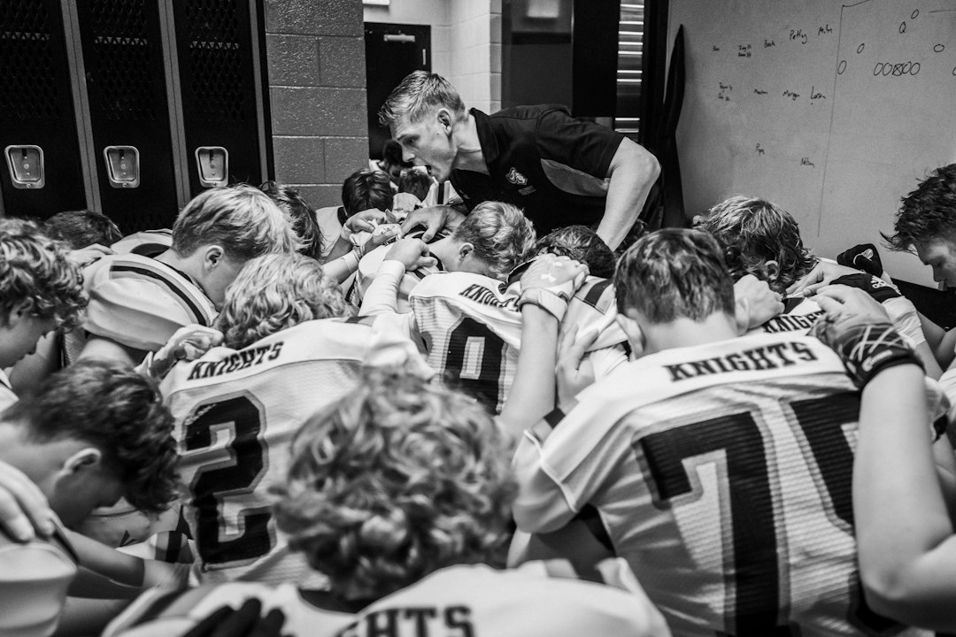
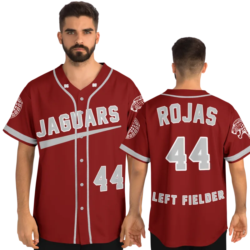
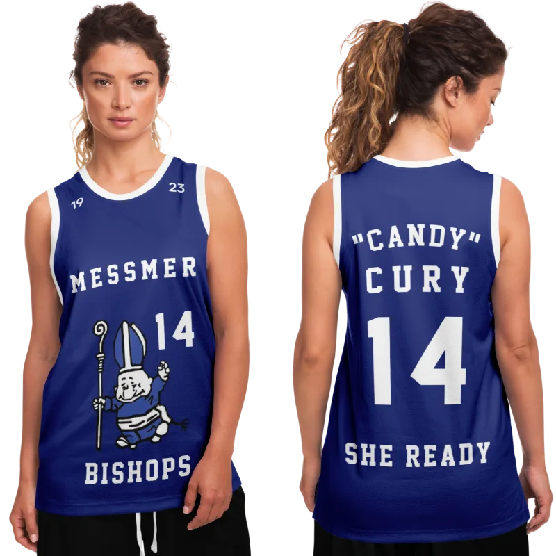
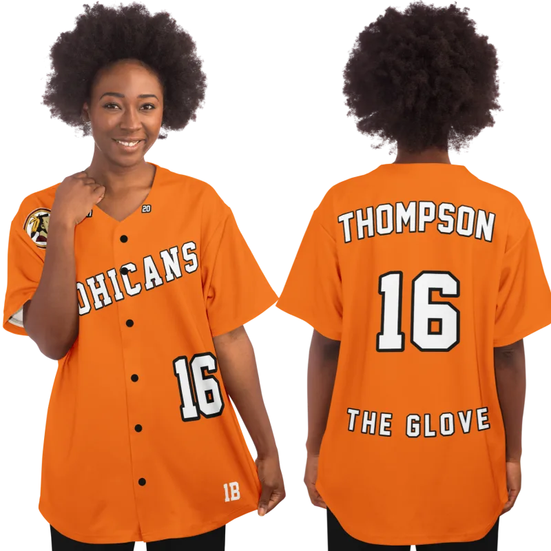
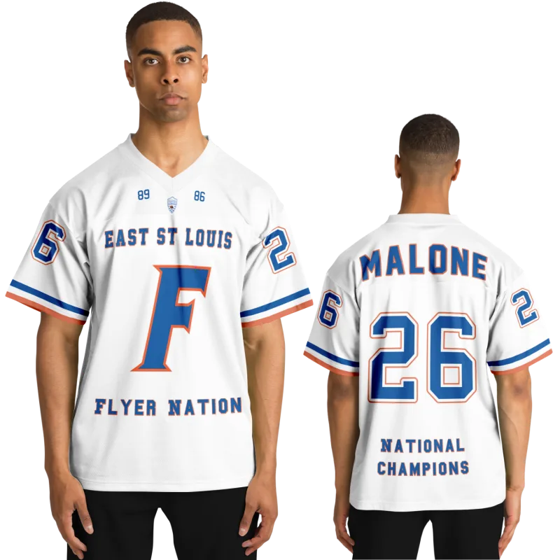
Every former athlete carries a specific moment somewhere in their memory. The new jerseys come out of the equipment bag for the first time. The coach reads names. Someone calls yours.
You hold it up. The number belongs to you. The name on the back belongs to you. Every jersey in that gym or locker room matches the one you're holding — same colors, same cut, same school — but that one is yours in a way nothing else in your life is at that exact moment.
What you may not have considered is that the memory has design elements embedded in it. The weight of the fabric in your hands. The way the numbers sat — raised, dimensional, physically sewn into the material rather than pressed or printed onto it. The font your school had used since before you got there. The color blocks along the shoulders or down the sides that were specific to your program, your era, your team.
That is what retro sports jersey design actually is — not a trend, not a throwback aesthetic for its own sake, but a visual vocabulary that your team spoke in a specific dialect, during a specific window of time, and that you still recognize the moment you see it.
This article decodes that vocabulary. What those construction elements were called, why they produced the visual effect they did, and how former athletes who want to honor that look today — for a reunion, a gift, or the simple satisfaction of wearing something that carries real meaning — can articulate exactly what they're after.
The Construction Elements That Defined an Era of Retro Sports Jersey Design
Walk into any sporting goods store today and you'll find jerseys engineered to precise performance specifications. The fabrics are tested. The graphics are optimized for broadcast clarity. The fit is calibrated against movement data.
What you will not find unless you go looking for it specifically is the visual weight of a jersey from twenty or thirty years ago. That weight — literal and visual both — came from specific construction decisions that defined an entire generation of athletic wear and produced the aesthetic we now recognize as classic retro sports jersey design.
Tackle Twill: The Raised Letter That Meant Business
If you played before the mid-2000s and your program had any real equipment budget, your jersey numbers and name block were tackle twill. This construction technique produced the dimensional, raised lettering you could feel with your fingertips — layers of twill fabric cut into the letterform and sewn directly onto the jersey body, edge by edge.
The result was a number with physical presence. It caught light differently from the surrounding fabric. It had edges you could trace. When it was new, it communicated something that a printed number simply cannot: this was built to hold up. Quality tackle twill applications maintained their shape through hundreds of wash cycles and the particular punishment of contact-sport laundry rooms.
The craft behind it was genuine. Each number was constructed from multiple fabric layers. The base layer established the primary color. Additional layers introduced shadow effects or two-tone designs. The stitching at the perimeter — sometimes visible as a clean edge line, sometimes buried — was what separated careful work from rushed work.
If your jersey had tackle twill lettering, you remember that it looked three-dimensional in a way that modern flat-printed jerseys do not reproduce. That dimensionality is not nostalgia distorting your memory. It is a physical property of the construction method.
Chain Stitching and Name Blocks
The name on the back of a jersey is a small thing that carries disproportionate weight. Every former athlete who wore their name on a jersey knows precisely what that felt like the first time.
In the classic construction era, name lettering was often chain-stitched — a looping stitch technique that gave individual letters a slightly raised texture distinct from the surrounding fabric, visible at close range and in angled light in ways that flat-printed names do not achieve.
Font selection for name blocks was frequently constrained by what the embroidery or tackle twill shop could actually produce at that time — which is itself part of why so many jerseys from a given era share similar letterforms. The classic athletic block letter, the varsity serif, the condensed grotesque: these were not arbitrary choices. They were the letterforms that the production technology of that moment could render cleanly at jersey scale.
Stripe Architecture and What It Communicated
The stripes on your jersey were doing specific visual work, and each type of stripe was constructed differently.
Side insert panels — the differently colored sections running vertically along the torso — were often cut from a separate piece of fabric and sewn into the jersey body. This created a true color block with a physical seam, not a printed approximation of one. At close range, you could see and feel where the panel met the main body. That seam was a construction artifact, and it is one of the clearest visual markers that separates authentic period jerseys from modern interpretations.
Shoulder stripes and sleeve bands followed similar logic. They were often separate applications — sewn on or structurally integrated into the garment rather than printed over a base fabric. The fact that they sometimes faded at a slightly different rate from the main body, or sat at a marginally different thickness, was not a defect. It was evidence of real layered construction.
Color Theory That Belonged to Your School and Nobody Else
One of the least-discussed dimensions of classic retro sports jersey design is how color worked differently in that era — not just which colors programs selected, but how those colors behaved on the fabric and how inconsistently they could be specified from one production run to the next.
Why Your School's Royal Blue Was Not Anyone Else's Royal Blue
Modern jersey production uses digital color management systems. When a program specifies a Pantone color today, that color is matched precisely across every garment from every vendor in every season.
That standardization was not always in place.
Before digital color management became industry-standard, the specific royal blue of your school's jersey was the royal blue that your supplier mixed, in that production run, in that year. It might vary slightly from the previous year's jerseys. It was almost certainly not identical to the royal blue used by another school two counties over that considered themselves the same color family.
This is why jerseys from that era often carry a specificity of hue that is genuinely difficult to match today. The color was, in a meaningful sense, your school's color — not a category, but a particular instance within a category. Former athletes describing their school's colors often reach for phrases like "it was more of a teal than a straight green" or "it was a darker maroon, almost burgundy in certain light." That precision is real. It is the residue of a production environment that could not fully standardize what it was producing, and in its inconsistency, it accidentally created something specific.
The Visual Discipline of a Two-Color Palette
Classic jersey design operated under color constraints that produced visual economy. When a jersey worked with two colors plus white, every element that made it onto the final garment had to earn its place within that limit.
The result, in the best programs, was a design discipline that unlimited sublimation palettes can struggle to match. The piping that outlined the number in a contrast color was not decorative — it was making the number readable from the upper rows of bleachers under fluorescent gym lighting. The color shadow applied to the base of a letterform created depth without requiring a third color. Every design decision was solving a real problem. That functional constraint is a significant part of what gives classic jersey design its visual integrity.
Fabric, Weight, and the Tactile Memory of Playing
There is a specific weight to a game jersey from a certain construction era that former athletes still recognize in their hands, years after the last time they wore one.
Nylon mesh. Heavy polyester dobby. The rough hand-feel of a classic football jersey fabric versus the slick surface of a basketball uniform. These were not primarily aesthetic choices — they were functional choices driven by the demands of specific sports and the manufacturing capabilities of specific moments in textile production.
Mesh Construction and What It Said
The mesh jersey — a knit fabric with an open, visible weave — is among the most recognizable elements of classic athletic wear. Basketball and football jerseys of a certain era were constructed from mesh fabrics that were thick and substantial by today's standards.
That weight communicated something. It said: this is a game garment. This is not a practice shirt or a scrimmage vest. This was made to absorb effort.
The mesh also had optical properties that interacted with applied graphics in specific ways. Numbers and name blocks sewn onto mesh had to contend with the texture of the underlying fabric. The small visual irregularities this created — the way tackle twill letters sat slightly above the weave — are part of what makes authentic period jerseys immediately legible to anyone who wore one.
The Shift to Sublimation and What It Changed
The move to sublimation printing — a process that bonds dye directly into polyester fabric at high heat — changed the visual language of athletic wear at a fundamental level. Sublimation enables gradients, photographic detail, and unlimited color at virtually no additional cost per unit.
What it cannot do, by definition, is create physical texture. A sublimated number is flat. It lives in the fabric rather than on top of it. It will never peel because it has no separate layer to separate from.
Whether this represents progress depends entirely on what you valued about the jerseys of your era. If the dimensional presence of a sewn-on number was part of what made the garment feel real to you, sublimation is a different visual language — not an upgraded version of the previous one. Many former athletes who commission tribute jerseys today specifically request tackle twill for exactly this reason: not because it performs better, but because it is the authentic construction method for the aesthetic they are trying to honor.
The Font That Belonged to Your Team
Marcus T., 44, grew up in rural Ohio playing six-man football for a program that had used the same jersey template since the early 1980s. When he reached out to design a tribute jersey for his 25-year reunion, the first thing he said was: "The number has to be in that exact font. Everyone who played for us knows that font. It's not negotiable."
He was right that it wasn't negotiable, and he was also right that the font was doing real identity work. For the people who had worn it, that specific letterform — a condensed sans-serif with particular weight on the horizontals — was the visual signature of belonging to something. It was not interchangeable with any other athletic font, even formally similar ones.
This is one of the most consistent patterns in the experience of recreating classic jersey aesthetics: the font carries more identity information than almost any other single design element. Former athletes who cannot name any other specific detail of their uniform will describe the number font in enough detail to identify the family and weight.
The classic athletic font families that defined an era of high school jersey design include:
- Full Block: Squared letterforms with uniform stroke weight — used extensively in football and basketball programs that wanted a timeless, authoritative appearance
- Varsity Collegiate Block: Serif additions to the block letter, often with a slight taper — associated with classic American sports identity, particularly in baseball and basketball programs
- Condensed Athletic: Narrowed proportions that allowed larger point sizes in constrained spaces — common in programs that wanted maximum visual impact from the stands
- Shadow Block: A two-layer letterform with a contrasting offset behind the primary character — popular in programs with enough budget to invest in dimensional number construction
Each family has dozens of variations, and the specific variation your program used was often the result of which catalog page your equipment manager happened to be looking at in a given ordering year. That specificity is now exactly the thing former athletes spend real effort trying to recreate.
Piping, Borders, and the Quiet Work of Visual Separation
The thin contrasting line that outlined a number, bordered a stripe, or traced the edge of a collar was called piping, and it was doing more visual work than its small physical size suggested.
At distance — the distance of the stands, the distance of a photograph, the distance of decades of memory — piping is what kept design elements readable. A royal blue number on a navy jersey is nearly invisible without a white piping outline. A three-color piping sequence created visual separation between jersey elements that allowed a complex design to remain legible at any viewing distance and under any lighting condition.
The width of the piping, the colors used, and which elements it appeared on were all design decisions that varied by era and by program. Some schools used piping extensively — outlining every element, running it along every structural seam. Others used it surgically, only where contrast absolutely required it. The restrained approach often produced the most visually sophisticated results, because every piping application had an obvious functional justification.
If you played, you know. You know whether your jersey had thin piping or thick piping. You know whether it was single-color or two-color. You know whether the numbers had it at all. That knowledge is specific and accurate because you wore it and it was part of how you recognized yourself and your teammates from across the field.
According to the Textile History journal's documentation of American sportswear construction, the period between 1975 and 2000 represents the most distinct and technically diverse era in domestic athletic uniform manufacturing — a window when regional suppliers, craft-based construction methods, and limited standardization combined to produce genuinely distinctive garments that varied meaningfully from program to program and year to year.
How to Specify What You're After When You Order a Custom Jersey
The gap between "I want it to look like my old jersey" and "I know exactly what to specify" is what most of this article has been building toward.
When you approach a custom jersey builder — whether for a school jersey design project, a reunion order, or a personal tribute piece — the elements you need to be able to describe clearly are:
- Construction method for numbers and letters: Tackle twill (dimensional, sewn-on fabric) versus sublimation (flat, dye-bonded) versus heat transfer. If the authentic visual and tactile quality of the original era matters to you, tackle twill is the correct specification for designs from before the mid-2000s.
- Font family and weight: Bring a reference image whenever possible. Font names are helpful but imprecise — the same name can describe multiple variations. A photograph of the actual jersey removes ambiguity entirely.
- Color specifications: If you have access to the original garment, bring it to any in-person consultation or photograph it in natural light. If not, Pantone matching is the most precise method available. "Royal blue" describes a category; a Pantone code describes a color.
- Piping details: Width, color sequence, and which elements it appears on — numbers only, name block, collar, or all structural seams.
- Stripe construction: Whether side panels were sewn-in color blocks or printed graphics, and whether shoulder or sleeve stripes were applied separately.
The practical reality is that the more specifically you can describe what you're after — using the vocabulary above — the closer the final garment will be to the jersey you remember. Saying "the numbers were sewn on with a white outline, a blue shadow, and the font was more squared than curved" gives a high school jersey maker something precise to work with. "Make it look old school" does not.
The school jersey design process works best when former athletes arrive with the descriptive vocabulary to match what they're carrying in their memory. That vocabulary is what this article was built to give you.
Your jersey is still out there waiting.
Design yours in minutes and see your name and number exactly the way you remember it.
Frequently Asked Questions
What is retro sports jersey design?
Retro sports jersey design refers to the visual language, construction techniques, and aesthetic conventions that defined athletic uniforms from roughly the 1970s through the early 2000s — before digital sublimation printing became the dominant industry method. The defining elements include tackle twill lettering (dimensional, sewn-on fabric numbers with physical texture), structured color blocking using sewn panel inserts rather than printed graphics, constrained color palettes that required disciplined design decisions, and classic athletic font families with strong visual presence at distance. It is called retro because these construction methods have largely been replaced by digital processes, but the aesthetic they produced remains highly recognizable and emotionally significant to anyone who wore that era's uniforms.
Can a high school jersey maker produce tackle twill construction on a custom jersey today?
Yes. While the default production method for most custom jersey orders today is sublimation or heat transfer — both faster and less expensive than tackle twill — quality custom jersey builders can still produce sewn twill lettering on request. It costs more and requires longer lead time because it involves skilled hand-application rather than automated printing. For former athletes who want an authentic tribute to the visual language of their playing era, the result is significantly more convincing than printed alternatives. When contacting a custom jersey builder, ask specifically about tackle twill availability and request to see samples of their stitch quality before committing to an order.
How do I describe my old high school jersey's font when I don't know its name?
A reference photograph is the most useful tool — a team photo, an action shot, or a game program from that era eliminates the ambiguity of trying to describe a letterform in words. If no photograph is available, the most useful descriptors are: overall proportions (tall and narrow versus wide and squat), stroke weight (uniform thickness across all strokes versus variable thickness), whether serifs are present (small horizontal lines at the ends of letter strokes), and the shape of rounded letters like O, C, and D (perfectly circular versus slightly flattened or squared). A skilled jersey designer can work from this description to identify or construct a matching letterform. The classic full block athletic font and the varsity collegiate block account for the majority of what high school programs used during the peak era of classic jersey construction, so starting with those two families and describing how your jersey's font differed from them is an efficient way to narrow it down.
Does the fabric specification matter for a custom jersey ordered as a tribute or display piece?
For display purposes, the visual elements — font, construction method, color, stripe design — carry more weight than the fabric specification. If the tactile authenticity of the garment is part of what you're after, however, it is worth discussing fabric options with your custom builder. Some suppliers stock heavier polyester fabrics that approximate the hand-feel and drape of classic game jerseys more closely than the ultra-lightweight performance fabrics that are standard for modern athletic production. For a wall-mounted or framed piece, fabric choice is primarily aesthetic. For something you intend to wear to reunions or events, a heavier fabric will read as more authentic both visually and in the hand.
See also: personalized sports gifts that actually make a former athlete feel seen | what to do with your old varsity letter jacket | the psychology of why high school sports still matter to adults | custom softball jerseys built around your name and number