


You have a committee of four people, a shared Google Doc with 11 conflicting suggestions, and a print deadline in three weeks. Someone has already proposed putting the mascot on the front. Someone else wants the inside joke from junior year that maybe eight people will remember. The budget is locked at a price per shirt that only works if you hit 200 units.
This is exactly when bad class reunion t shirt ideas get committed to cotton — permanently, at scale.
Most guides on this topic show you what to do. They give you templates, font pairings, color palettes, and cheerful mockups of smiling attendees. What they skip is the part that actually costs you: the specific decisions that look fine in a preview and land wrong in real life. Wrong in photos. Wrong for half the room. Wrong five years from now when someone pulls the shirt out of a drawer and can't remember why it seemed like a good idea.
This article covers the mistakes — the specific ones — before you lock in your reunion t shirt design and hand the file to a printer.
The Inside-Joke Problem (and Why Athletes Are Especially Vulnerable to It)
Here is the tension that destroys more class reunion shirt ideas than any other single factor: the people who end up running the planning committee are almost always the people who stayed connected. The ones who know each other. The ones with the shared references.
Which means they design shirts for themselves.
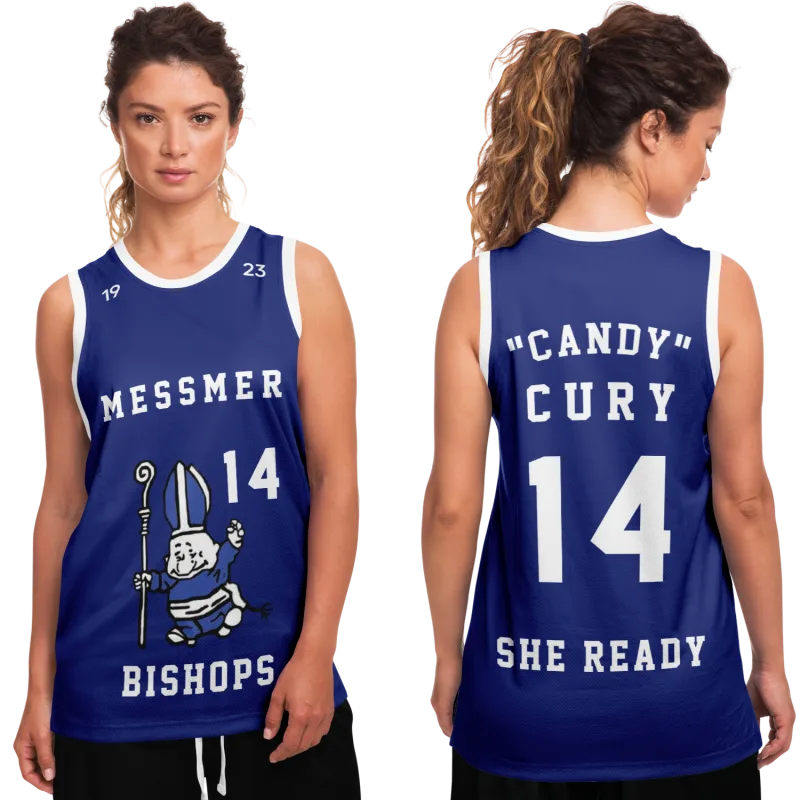
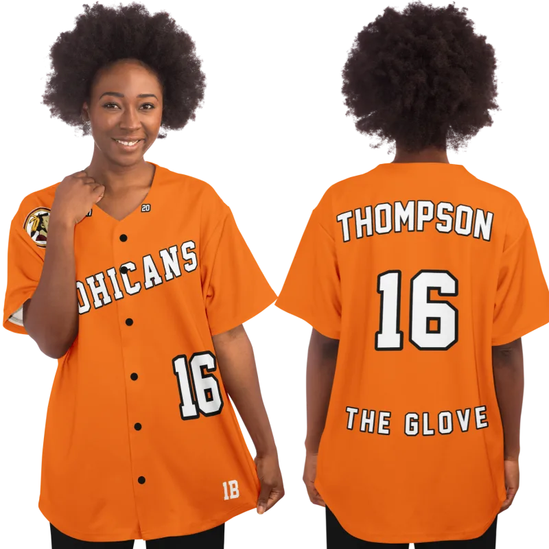
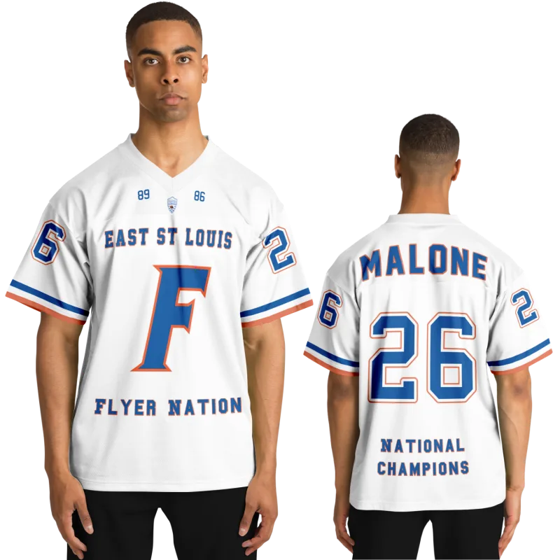
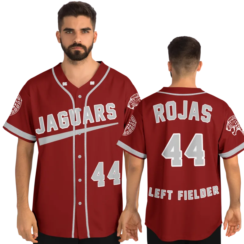
Former athletes are particularly prone to this. If four of the five committee members played on the same team, the shirt concept that emerges will often lean hard into team culture — a jersey number that meant something in 1998, a coach's catchphrase, a game-week tradition that the other 180 people in the class never experienced. It's not malicious. It's just proximity bias at scale.
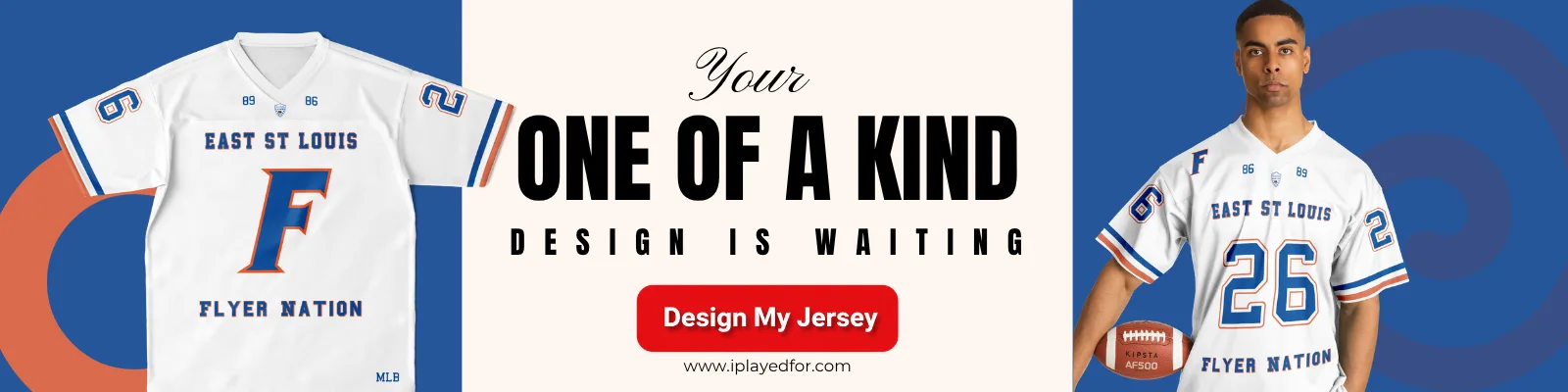
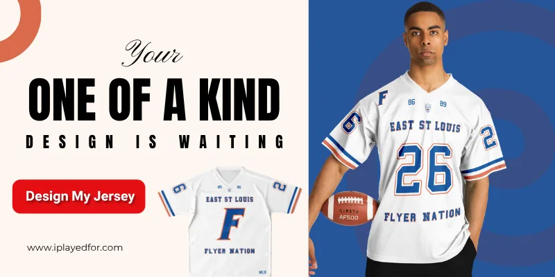
The result is a shirt that works perfectly as a team reunion shirt and fails completely as a class reunion shirt. The former swimmers, the theater kids, the people who didn't go to a single Friday night game — they receive a wearable document of an experience they were never part of.
The test to run on any inside-reference concept: If you read the shirt to a random classmate who wasn't in that specific circle, do they smile or do they tilt their head? If the head-tilts outnumber the smiles among a representative sample of the class, the reference is too inside to anchor your design.
This doesn't mean the shirt has to be generic. It means the shared reference should be genuinely shared — the school itself, the era, the collective experience of being in that building together at that specific moment in time. The mascot works better than the quarterback's nickname. The graduation year works better than the locker room phrase.
The Specific Designs That Read as Exclusive Rather Than Inclusive
- Jersey number tributes — meaningful to teammates, invisible to everyone else
- Coach quotes in context — if you need context to understand why it's funny, it needs context to work on a shirt
- Sport-specific terminology — "DD214 alumni" reads clearly to veterans in the class; it reads as random text to everyone else
- Scoreboard references — "We beat Eastside 34–17" is a shirt for eleven people
These aren't bad ideas for a team-specific reunion. They're wrong for a class-wide event where your goal is a shirt that the whole room actually wants to wear home.
Designs That Date Immediately — The Specific Culprits
There's a category of reunion tee shirt ideas that look contemporary at the time of printing and look dated within 24 months. The problem isn't that they're bad designs. The problem is that they're borrowing from a trend cycle that moves faster than a reunion shirt's usable life.
Reunion shirts tend to get worn for years after the event. They get pulled out for casual Saturdays, worn on errands, spotted in the back of closets. When you anchor your reunion t shirt design to a trend that peaks and fades, you turn a potential keepsake into a time capsule of a very specific aesthetic moment.
The trend-borrowing patterns to avoid:
- Meme formats applied to class years — "Class of 2004: We are the ones who knock" worked for exactly one reunion cycle
- Pop culture references with an expiration date — anything that leans on a show, a phrase, or a moment that is currently at peak saturation will feel exhausted in eighteen months
- Font trends — retro serif stacks and distressed block lettering both follow trend curves; if you've seen that exact typographic treatment on three things in the last six months, it has an expiration date
- Overly specific year callbacks — "Back when gas was $1.89" is clever in the planning meeting and painfully dated by the second reunion
The class reunion designs for t shirts that hold up over time are almost always the ones that lean into the timeless rather than the timely. The school name. The years attended. A clean graphic that reflects the institution, not the moment. These don't photograph as sharply in the first week, but they're the shirts people are still wearing ten years later.
Color Decisions That Work Against You in Every Group Photo
This one is underestimated almost universally, and it shows up in group photos at nearly every reunion.
The color that looks excellent on a screen — or on one shirt held up against a neutral background — frequently does the opposite of what you want when it appears on 200 people standing together under real light. And the group photo is the deliverable that lasts longer than the event itself.
The specific color mistakes:
Neon and near-neon: Saturated yellow-green, electric blue, and hot pink create bloom in photos shot under any kind of artificial or mixed lighting. The shirts appear to glow in a way that flattens faces and washes out the people wearing them. They look great in the design file. They look harsh in every photo taken at the venue.
Dark shirts at evening events: Dark navy, black, and charcoal shirts at indoor evening reunions — where venue lighting tends to be warm and low — make it genuinely difficult to see the design from more than ten feet away. The shirt reads as a dark mass in photos. The design disappears.
Colors that don't photograph neutrally: White and light gray are the highest-contrast options for group photos and the most versatile across skin tones and lighting conditions. They're also the most commonly avoided by committees who think "white seems boring." White is not boring in a group photo. It's the reason you can see everyone.
The practical test: Before finalizing your color, find a photo from the reunion venue (or a venue with similar lighting) with a crowd wearing clothing in your target color. This tells you more than any mockup.
The Text-Heavy Design Trap
There is a version of class reunion shirt ideas that tries to do too much. The front has the school name, the class year, the mascot, and the reunion date. The back has every committee member's name, a quote from the class motto, and a list of decades since graduation. The design file, zoomed in at 100%, looks complete and meaningful.
Printed on a shirt and worn by a person standing across the room, it reads as texture. Not words. Texture.
Reunion shirts are worn and photographed from a distance. The design elements that read at five feet are not the same elements that read at twenty feet. Text smaller than roughly 1 inch in height on the final garment disappears in real wear.
What the shirt actually needs to communicate:
- The school or institution (1–3 words, large)
- The class year or years attended (numbers, large)
- One optional graphic element that doesn't require reading
That's it. Everything else is filler that the shirt physically cannot carry.
The Nike alumni shirt and the Western Michigan alumni apparel you see in university bookstores have figured this out through decades of iteration: school name, wordmark, year. Clean. The rest is noise that experienced licensees have already learned to leave out.
The Sizing and Fit Problem Nobody Addresses Until It's Too Late
Marcus T., 42, organized his 20-year high school reunion in the Chicago suburbs and ordered 220 shirts in the size distribution he remembered from graduation: mostly mediums and larges, a handful of smalls, a few XLs. At the event, he had forty-five shirts that didn't fit anyone who wanted them and was fielding requests for 2XL and 3XL from classmates who had been overlooked entirely. Some people didn't take a shirt at all.
This is one of the most consistent logistical failures in reunion shirt planning — not design-related, but just as likely to leave committee members fielding complaints at the event.
The standard assumption is that sizing stays close to what it was at graduation. It doesn't. For reunions happening 10, 15, or 20 years out, the size distribution of your class has shifted meaningfully toward larger sizes across the board. If your class was 60% mediums and larges in 1998, it is probably closer to 60% larges, XLs, and 2XLs now. Order accordingly, include 3XL options, and collect size preferences in advance if at all possible.
What Actually Ages Well: The Design Principles That Survive
Since this article is about what to avoid, it's worth being specific about what the inverse looks like. The class reunion shirt ideas that hold up are built on a small set of consistent principles.
Institution-first, event-second: The school name carries more weight than the reunion itself. A shirt that says "Lincoln High School" with the class year reads as alumni gear indefinitely. A shirt that says "Lincoln High 20-Year Reunion — June 2024" reads as an event shirt with an expiration date.
Years over dates: "Class of 2004" ages well. "Class of 2004 Reunion, June 7–8, 2024" ages immediately the moment the date passes.
Simple, structured graphics: The Hogwarts alumni t-shirt that became a broadly recognizable cultural object works because it uses a clean institutional format — crest, house names, clean text hierarchy — that reads as authentic alumni gear rather than event merchandise. The same design logic applies to real institutions.
Two colors maximum: Every additional color adds print cost, adds visual noise, and reduces the number of scenarios where the shirt reads cleanly.
Back-of-shirt information as optional, not central: If you want to include the roster or the reunion date, put it on the back in secondary type. The front should work as a standalone identity piece.
The National Lampoon Problem
There's a specific kind of reunion shirt that gets conceived in a spirit of self-aware humor and lands differently at the event. The "Class Reunion National Lampoon" approach — shirts that lean into a joke about how much time has passed, how everyone has changed, how this is nothing like the movies — can work brilliantly when it's executed with genuine wit and fails completely when it reads as either mean-spirited or trying too hard.
The specific failure modes:
- Jokes about aging that feel different to a 38-year-old who's had a hard decade than they did in the planning meeting
- Self-deprecating school pride humor that the people who loved the school don't actually find funny
- "Survivor" framings ("We made it!") that feel tone-deaf when some classmates didn't
Humor is the highest-upside and highest-risk category in reunion shirt design. If your committee can't achieve unanimous agreement that a concept is funny — not just the four people in the planning meeting, but a broader cross-section of classmates — the safer call is to drop the joke and go classic.
Your jersey is still out there waiting.
Design yours in minutes and see your name and number exactly the way you remember it.
Frequently Asked Questions
How many shirt sizes should I order and in what distribution?
For a reunion happening 15 or more years after graduation, a reasonable starting distribution is: 10% Medium, 25% Large, 30% XL, 25% 2XL, 10% 3XL — but the best approach is always to collect size preferences directly from attendees during registration. Any printer willing to do a run of 200+ shirts can accommodate specific size breakdowns if given enough lead time. Never assume the size distribution mirrors what your class looked like at graduation.
How far in advance should we finalize the design and place the order?
For a run of 200 shirts, plan for a minimum of three weeks between final design approval and the event date — and four to five weeks is safer if you want any buffer for reprints or corrections. The design approval step is where most committees lose time: plan for at least two rounds of revisions and get sign-off from more than one committee member before submitting to print. Rushing the design approval is how errors get committed at scale.
Should the reunion date appear on the shirt?
This depends on how you want the shirt to function after the event. A date makes the shirt a commemorative piece — specific to this reunion, clearly situated in time. Without the date, the shirt functions as ongoing alumni gear that people will actually wear in public for years. For most reunions, omitting the specific date from the front design and optionally including it on the back produces a shirt with a longer useful life. The exception is milestone reunions (25th, 50th) where the commemorative function may outweigh the wearability concern.
What's the most common design mistake that can't be fixed after printing?
Text that's too small to read at normal viewing distance. This is the most irreversible error because it isn't visible until the shirt is physically in hand. Any text element that you want to be readable from across a room needs to be at least 1 inch tall on the final garment. Proof your design at actual print size — not at 100% zoom on a 27-inch monitor — before approving the final file.
See also: personalized vs. generic gifts for former athletes | reconnect with former high school teammates | custom softball jerseys for alumni games | why senior season memories stay so vivid